The Bootstrap is most popular front end framework for creating websites and web applications. Bootstrap is a powerful front end framework which makes faster and easier web development. It includes CSS and HTML for typography, icons, forms, buttons, tables, layout grids and other interface components, as well as optional JavaScript extensions. It is combination of HTML, CSS and JavaScript which helps in building user interface components.
Getting Started with Bootstrap
It is easy to get started with Bootstrap. This section explains how to download and setup the Bootstrap. The first thing is to download required files.
We can download latest version of Bootstrap from the link: getbootstrap.com/ and download the latest archived files. There are three types of downloads available for Bootstrap;
- Download Bootstrap
- Download Source
- Download Sass
as shown in the following picture:

- Download Bootstrap: Click on Download Bootstrap link, Once download is complete, unzip the file and we will get a folder named simply “bootstrap” which includes compiled CSS and JS and minified CSS and JS and fonts from glyphicons are included and they will have the following file structure:

- Download Source: Click on Download Bootstrap Source link, Once download is complete, unzip the file and we will get less, js and fonts files which source code for Bootstrap CSS, JS and fonts respectively. The docs folder contains assets, layouts, data, examples etc which are useful for Bootstrap documentation. The dist folder includes js, fonts and css which are defined in the download section above. It has following file structure as shown below:

- Download Sass: It is Sass powered version of Bootstrap. Sass is stable, powerful CSS extension language which is compatible with all versions of CSS. Bootstrap is ported from Less to Sass which provides support for Rails, Compass or Sass only projects.
Bootstrap CDN
Bootstrap CDN is free and public Content Delivery Network. Bootstrap uses MaxCDN’s global content delivery network which provides support for Bootstrap’s CSS and JavaScript. It is easy to use Bootstrap with a CDN. We can use following Bootstrap CDN links:
Developers can access Bootstrap CDN’s complete CSS with the following:
<link rel=”stylesheet” href=”//netdna.bootstrapcdn.com/bootstrap/3.1.1/css/bootstrap.min.css”>
<link rel=”stylesheet” href=”//netdna.bootstrapcdn.com/bootstrap/3.1.1/css/bootstrap-theme.min.css”>
Bootstrap CDN’s JavaScript Libraries:
<script src=”//netdna.bootstrapcdn.com/bootstrap/3.1.1/css/bootstrap.min.js”></script>
As shown in above, bootstrap.min.css and bootstrap.min.js are two CDN links which provides support for Bootstrap’s CSS and JavaScript. These files are included to make normal HTML file to Bootstrapped template. The advantage of using CDN is that you need not download any source files for the bootstrap.
also read:
Bootstrap Example
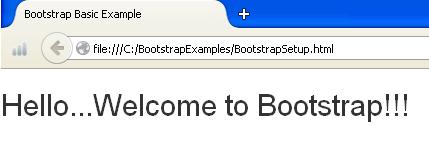
Here is a simple example for how to import the bootstrap for your project. This example doesn’t implement any other logic, but just shows how to start using the bootstrap.
<!DOCTYPE html>
<head>
   <title>Bootstrap Basic Example</title>
   <meta name=”viewport” content=”width=device-width, initial-scale=1.0”>
    <link rel="stylesheet" href="http://netdna.bootstrapcdn.com/bootstrap/3.1.1/css/bootstrap.min.css">
</head>
<body>
   <h2>Hello...Welcome to Bootstrap!!!</h2>
   <script src="https://code.jquery.com/jquery.js"></script>
   <script src="js/bootstrap.min.js"></script>
</body>
</html>
- As shown in above code, we have used meta tag which provides information of data. It will not be display on the page, but will be machine parsable. The meta tag always goes inside head tag. It contains attributes such as name which defines name for the metadata, content which gives value associated with name attribute which in turn contains device-width property to set width of the device screen and initial-scale attribute describes the initial zoom when visiting the page. 1.0 does not zoom.
- The next line contains CDN link <strong>bootstrap.min.css</strong> which provides support for Bootstrap’s CSS.
- The two CDN links, <script src=https://code.jquery.com/jquery.js> </script> and <script src=”js/bootstrap.min.js”> </script> are necessary for Bootstrap’s JavaScript plugins and include all compiled plugins or individual files as needed.

Responsive Design using Bootstrap
When we use the word “Responsive” in the context of website, first thing comes to our mind that it should be compatible with all kinds and sizes of the devices. It has become an essential technique in which every web designer must be conversant with. The responsive design is a concept which leads to design a website or app in such a way that the same design can be rendered across various devices of different screens and provides the users with the best possible user experience.
It provides functional built in components which are easy to customize and also provides web based customization. The Bootstrap’s responsive design adjusts to Desktops Tablets and mobiles. There is demand to make every web site responsive for better readability of the online contents in different environments.
Browser Support
Bootstrap is supported by all popular browsers. The following list shows on which platforms browsers supports the Bootstrap.
- Windows: Google Chrome, Mozilla Firefox, Internet Explorer, Opera and Safari.
- Mac OS: Google Chrome, Mozilla Firefox, Opera and Safari.
- iOS: Google Chrome, Safari.
- Android: Google Chrome.

 Spring Data REST + GemFire Repository + Sencha Touch Integration