In this article we look at the operation of flexbox in CSS3, their properties, and examples of applications and how to create flexible layouts with CSS3. Flexbox or else Flexible Box Model is a new concept in CSS3 which aims to organize and align the HTML elements in a dynamic and very easy. Forget the old alignment of HTML elements with properties such as float , or with calculations and attitudes that just plastering your layout. The flex-box came to remedy the use of these properties and make your layout more flexible and responsive.
Flexbox Properties and Values
Before applying this “magic” tool in a few examples , let’s see the operation of the properties and their values. The element forming the flexible called Flex container and the child elements of the container Flex are called Flex Items. To create a Flex Container on a project use the property display with the value flex or inline-flex :
- display: flex; – determines that this element is a block.
- display: inline-flex; – determines that this element is inline block.
In Listing 1 and Listing 2 we have the example of the creation of the divs and classes.
Listing 1: Html code
<!DOCTYPE html>
<html>
<head>
<meta http-equiv="Content-Type" content="text/html;charset= utf-8"/>
<link href="flexbox.css" rel="stylesheet" type="text/css"></link>
<title>Flex Box</title>
</head>
<body>
  <div>
	<div>ChildOne</div>
	<div>ChildTwo</div>
	<div>ChildThree</div>
  </div>
</body>
</html>
Listing 2: CSS content in flexbox.css
.divParent{
background:#CCC;
display:flex;
}

.divChildOne, .divChildTwo, .divChildThree{
background:red;
color:#FFF;
padding:3px;
border-radius:10px;
}
.divChildTwo{
background:green;
height:100px;
}
.divChildThree{
background:blue;
height:230px;
}
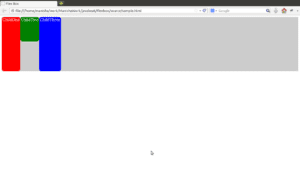
Open the HTML code in the Lsiting 1 in your browser and the an output as shown below would be displyaed:

Figure 1.The output
By applying the property display: flex, the div “divParent “ , created a Flex Container. For the flex-box to really make sense, it must be shown to Flex Container as Flex Items must be organized in the container with the following properties:
1. flex-direction: this property specifies whether the Flex Items will be positioned on the horizontal axis, inverted horizontal, vertical or inverted vertical.
Values :
- row, row-reverse, column, column-reverse.
- Flex-direction: row; (default): sorts the Flex Items horizontally.
- Flex-direction: reverse-row; : sorts the Flex Items reversed horizontally.
- flex-direction: column;: sorts the Flex Items upright.
- Flex-direction: column-reverse;: sorts the Flex Items upright but with the order reversed.
2. flex-wrap: this property specifies whether the Flex Items will be broken into multiple rows and columns based on the space of Flex Container or simply will not be broken.
Values:
- None, wrap, wrap-reverse.
- Flex-wrap: none; (default): This value is the default and specifies that the Flex Items will be arranged in one row and one column.
<li>Flex-wrap: wrap; : Specifies that the Flex Items will be arranged in multiple rows and columns, depending on the size of Flex Container .
- Flex-wrap: wrap-reverse; : the operation is similar to the wrap , but reverses the order of Flex Items.
3. flex-flow: is a junction between direction-flex and flex-wrap .
Values: Value (flex-direction) | | value (flex-wrap).
4. order: Sort child elements according to the number specified in each.
Properties: Integer Number.
Default value: 0.
Below we see the properties of flexibility:
5. flex-grow: This property determines that a particular Flex Item grow towards others.
Values: Integer Number.
Default value: 0.
6. flex-shrink: Determines how Flex Item will reduce towards others.
Values: Integer Number.
Default value: 1.
7. flex-basis: Fits determine the default value of the Flex-Item . The operation is similar to the width .
Values: Integer Number + Unit of Measure.
Default value: auto.
8. flex: is the junction of the above properties flex-grow , shrink-flex and flex-basis .
Values: Value (flex-grow) | | value (flex-shrink) | | value (flex-basis).
Below we see the alignment properties :
9. justify-content: Used to distribute the Flex Items online the way you would agree, according to the space provided by the Flex Container .
Values:
- Start-flex, flex-end, center, space between, space-around.
- Justify-content: flex-start; (default) – It is useful for those who want to align Flex Items for the beginning of the line of Flex Container . And all Flex Items are placed side by side without leaving any gaps between themselves.
- Justify-content: flex-end; – Similar to flex-start , however, the child elements are positioned at the end of the line -Flex Container .
- Content-justify: center; – Similar to the above values, the value center position the Flex-items in the center of the line without leaving gaps between them.
- Justify-content: space between; – This value is something truly “magical” in CSS3. The space-between is able to distribute all Flex Items by line uniformly. He places the first Flex Item stuck with the beginning of the line of Flex Container and the last pasted with the end of the line, and the other Flex Items scattered along the line spaced equally distributed.
- Justify-content: space-around; – This property is another tool “magic”, similar to the operation of space-between , but the spaces before the first Flex Item and then the last half of the spacing are assigned to other flexible items within the container .
10. ALIGN-items: This property is used to position the flex Items vertically according to the vertical space of the container Flex .
Properties:
- Stretch, flex-start, flex-end, center, baseline
- Align-items: Stretch; (default) – This value is able to stretch vertically all Flex Items up to the height limit of Flex Container .
- Align-items: flex-start; – With this value the child elements are positioned next to each other without leaving gaps between itself and aligned on top of Flex Container .
- Align-items: flex-end; – Similar to value flex-start , the child elements are positioned at the bottom of Flex Container .
- Align-items: center; – Locates all child elements vertically in the center of the Flex Container.
- Align-items: baseline; – All Items Flex are aligned with the baseline of the child element which occupies more space perpendicular to the axis of the arrangement.
11. Self-align: is used by a child element to modify the value defined by align-items .
Values:
- Auto, flex-start, flex-end, center, baseline, stretch.
- Self-align: auto; (default) – Maintains default value of align-items . If align-items is not set, the child element is stretched.
- Self-align: flex-start; – Ignores the value set in items-align and position the Flex Item early in the axis perpendicular to that defined by flex-direction .
- Self-align: flex-end; – Similar to flex-start , but positions the Flex Item at the end of the axis perpendicular to the defined flex-direction .
- Self-align: center; – Positioning Flex Item is centered on the axis perpendicular to that defined by flex-direction .
- Self-align: baseline; – Align the element with the base of Item Flex occupies more space perpendicular to the axis of the arrangement.
- Self-align: stretch; – Ignore what was defined in align-items and stretches the element .
12. align-content: This property is similar to property -justify content . However, this property takes effect only when the Flex Container has multiple lines. This property aligns the lines inside the Flex Container axis perpendicular to the property defined flex-direction .
Values:
- Stretch, flex-start, flex-end, center, space between, space-around.
- Content-align: stretch; (default) – Stretches the lines to the limits of Flex Container .
- Content-align: flex-start; – Aligns the child elements at the beginning of the shaft .
- Content-align: flex-end; – Aligns the Flex Items at the end of the shaft.
- Content-align: center; – Centralize the Flex Items axis.
- Align-content: space between; – First Item Flex stands side by side with the first axis and the latter along with the end. The child elements also divide the remaining gaps between them, filling the entire container.
- Align-content: space-around; – The child elements are divided equally spacing between them, filling the whole Flex Container . The spaces before the first item Flex and after the last half of the spacing are assigned to other flexible items within the container Flex .
Let’s list a few more examples with the current settings.
Creating an Ordered Menu using Flexbox
In Listing 4 and 5 have structures with only three properties of Flexbox to sort menu.
Listing 4: HTML code displaying the menu
<!DOCTYPE html>
<html>
<head>
<meta http-equiv="Content-Type" content="text/html;charset= utf-8"/>
<link href="flexbox2.css" rel="stylesheet" type="text/css"></link>
<title>Flex Box</title>
</head>
<body>
  <nav>
	<a href="#">HOME</a>
	<a href="#">PORTFOLIO</a>
	<a href="#">SHOP</a>
	<a href="#">COMPANY</a>
	<a href="#">CONTACT</a>
  </nav>
</body>
</html>
Lisitng 5. Organization and alignment menu using CSS
body{
background:#EEE;
}
nav{
background:#AAA;
width:700px;
height:35px;
margin:10px 0px 0px 10px;
justify-content:space-around;
align-items:center;
display:flex;
}
.btn{
background:#111;
width:100px;
height:20px;

font-family:Veranda,Geneva, sans-serif;
font-size:10px;
color:#FFF;
text-decoration:none;
text-align:center;
}
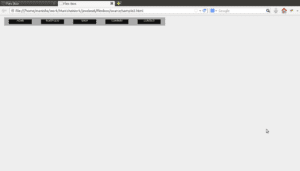
Open the HTML code in Lisiting 4 in a browser and you would see an output as below:

Figure 6. Results menu organized with Flex Box .
Creating an ordered layout easily
See in Lisiting 7 and 8 examples of how easy it is to organize the layout elements. Note that there has been no kind of calculation, only aligned using flex-box .
Listing 7. HTML code with declaration of tags, divs and classes
<!DOCTYPE html>
<html>
<head>
<meta http-equiv="Content-Type" content="text/html;charset= utf-8"/>
<link href="flexbox3.css" rel="stylesheet" type="text/css"></link>
<title>Flex Box</title>
</head>
<body>
 <article>
 <section>
 <div></div>
 </section>
 <section>
 <div></div>
 <div></div>
 <div></div>
 </section>
 </article>
</body>
</html>
Listing 8. Organizing the layout to justify content-, flex-direction, align-items and self-align Using CSS
*{
border-radius:10%;
padding:10px;
}
article{
background:#AAA;
width:500px;
height:300px;
margin:5%;
justify-content:space-around;
display:flex;
}
article section:nth-child(1), article section:nth-child(2){
background:red;
width:180px;
display:flex;
flex-direction:row;
justify-content:space-around;
align-items:center;
}

article section:nth-child(1){
background:blue;
justify-content:flex-end;
align-self:flex-start;
}

.childone, .childtwo{
background:#FFF;
width:30px;
height:20px;
}
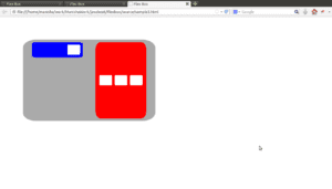
Open the HTML code in Listing 7 in your browser and you would see and output as below:

Figure 9. Results final layout
Summary
We saw few examples on how to use Flex Box feature. Do some examples yourself and see how easy it is to play with this tool. Use the Flex Box in your layouts and observe how they will be well accepted in various screen dimensions. If you have any thoughts, please write it in the comments section.

 Bean Validation in Java EE 7 – Creating Custom Constraints and Validations