
The jQueryUI Droppable plugin triggers when an accepted draggable is dropped ‘over’ this droppable. The interaction of droppable depends on draggable element. In general we can say that, target region for draggable element is droppable. We can create target on the page for dropping draggable elements.
also read:
The droppable widget can be used in two forms:
- $(selector, context).droppable (options)
- $(selector, context).droppable (“action”, params)
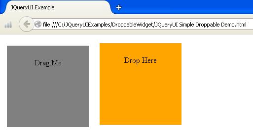
The following is a simple example of droppable widget:
<!DOCTYPE html>
<head>
<link href="http://code.jquery.com/ui/1.10.4/themes/ui-lightness/jquery-ui.css" rel="stylesheet">
<script src="http://code.jquery.com/jquery-1.10.2.js"></script>
<script src="http://code.jquery.com/ui/1.10.4/jquery-ui.js"></script>
<style type="text/css">
	#dragMe {
		   width: 150px;
		   height: 150px;
		   padding:0.5em;
		   background:gray;
		   float:left;
		   text-align:center;
		   margin:10px;
	}
	#dropMe
	{
		  width: 150px;
	 	  height:150px;
		  padding:0.5em;
		  background:orange;
		  float:left;
		  text-align:center;
		  margin:10px;
	}
</style>
<script>
	 $(function() {
		$( "#dragMe" ).draggable();
		$( "#dropMe" ).droppable();
	 });
  </script>
</head>
<body>
  <div id="dragMe">
	 <p>Drag Me</p>
  </div>
  <div id="dropMe">
	 <p>Drop Here</p>
  </div>
</body>
</html>
Run JQueryUI Simple Droppable Demo
Droppable Widget Options
The droppable widget contains following options:
| Option | Description | Default Value |
|---|---|---|
| accept | It specifies which draggable elements accepted for the droppable region. | * |
| activeClass | It specifies the CSS style for the droppable, when an accepted element is being dragged. | false |
| addClasses | The ui-droppable class could be prevent from being added, when it is set to false. | true |
| disabled | It indicates droppable element can be disable by setting it to true. | false |
| greedy | It will prevent event propagation on nested droppables as element is dropped when it is set to true. | false |
| hoverClass | It specifies one or more CSS styles will be added to droppable element, while element is being hovered on droppable region. | false |
| scope | It groups the sets of draggable and droppable elements to the items which have the same options. scope i.e. the draggable value can be accepted as droppable value. | default |
| tolerance | It is used for testing whether draggable is hovering over a droppable. | intersect |
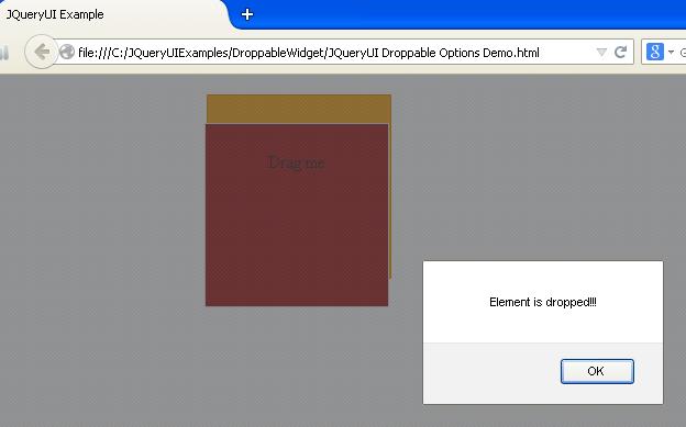
The following is an example:
<!DOCTYPE html>
<head>
<link href="http://code.jquery.com/ui/1.10.4/themes/ui-lightness/jquery-ui.css" rel="stylesheet">
<script src="http://code.jquery.com/jquery-1.10.2.js"></script>
<script src="http://code.jquery.com/ui/1.10.4/jquery-ui.js"></script>
<style type="text/css">
	   #dragMe
		{
			   width: 150px;
			   height: 150px;
			   padding:0.5em;
			   background:brown;
			   float:left;
			   text-align:center;
			   margin:10px;
		}
       #dropMe
	   	{
	   		  width: 150px;
	   		  height:150px;
	   		  padding:0.5em;
	   		  float:left;
	   		  text-align:center;
	   		  margin:10px;
	   }
	   .active
	   {
			 border-color : cyan;
			 background :#F781D8;
		}
	  .hover
	  {
			border-color : red;
			background : #00FF80;
	  }
</style>
<script>
      $(function() {
         $( "#dragMe" ).draggable();
         $( "#dropMe" ).droppable({
            activeClass: "active",
            hoverClass:  "hover",
            greedy: true,
            accept: '#dragMe',
		     tolerance: 'touch',
		     drop: function(){
			alert('Element is dropped!!!');
		     }
         });
      });
</script>
</head>
<body>
   <div id="dragMe" class="ui-widget-content">
      <p>Drag me </p>
   </div>
   <div id="dropMe" class="ui-widget-header">
      <p>Drop here</p>
   </div>
</body>
</html>
- The above example uses some of the options such as activeClass, hoverClass, accept and tolerance.
- When we run the script, if we drag the element over a droppable element, the background color and border color of the droppable element will get change when mouse hovered over the droppable.
- We are using CSS styles to make more effective result on the webpage; we are using ID selectors for drag and drop elements and class selectors for hover and active options.
- The greedy option will receive the element, when an element is dropped on droppable element.
Run JQueryUI Droppable Options Demo
Droppable Widget Methods
The following table shows some of the methods which are used with droppable widget:
| Method | Description |
|---|---|
| destroy() | It removes the droppable functionality . |
| disable() | This method disables the drop action. |
| enable() | This method enables the drop action. |
| instance() | It creates the droppable instance object. |
| options() | It returns the options property. It sets droppable option with specified option name. |
| widget() | It defines droppable element object. |
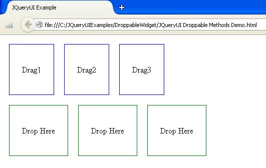
The following example demonstrates usage of methods:
<!DOCTYPE html>
<head>
<link href="http://code.jquery.com/ui/1.10.4/themes/ui-lightness/jquery-ui.css" rel="stylesheet">
<script src="http://code.jquery.com/jquery-1.10.2.js"></script>
<script src="http://code.jquery.com/ui/1.10.4/jquery-ui.js"></script>
<style>
 .dragMe
 {
	 padding: 40px 25px;
	 border: 1px solid blue;
	 float: left;
	  margin:10px;
 }
 .dropMe
 {
     padding: 40px 25px;
	 border: 1px solid green;
	 float: left;
	 margin:10px;
 }
</style>
</head>
<body>
   <div class="dragMe">Drag1</div>
   <div class="dragMe">Drag2</div>
   <div class="dragMe">Drag3</div>
   <div style="clear: both;"></div>
   <div class="dropMe">Drop Here</div>
   <div class="dropMe">Drop Here</div>
   <div class="dropMe">Drop Here</div>
<script>
   $(function() {
	   $('.dragMe').draggable({ revert: true });
	   $('.dropMe').droppable({
	       hoverClass: 'active',
	       drop: function(e, ui) {
	           $(this).html(ui.draggable.remove().html());
	           $(this).droppable('destroy');
	       }
        });
    });
</script>
</body>
</html>
- The above example makes use of method destroy which remove the droppable functionality and return the element back to its pre-init state.
- The CSS styles are used to make more effective the result should be displayed on the web page.
Run JQueryUI Droppable Methods Demo
Droppable Widget Events
The following table shows events which are used with droppable widget:
| Event | Description |
|---|---|
| activate(event, ui) | This event fires when the acceptable element starts dragging. |
| create(event, ui) | It fires when a droppable element is created. |
| deactivate(event, ui) | It fires when a draggable element stops dragging. |
| drop(event, ui) | It fires when the draggable element is dropped on the droppable. |
| out(event, ui) | It fires when draggable element is dragged out of the droppable. |
| over(event, ui) | It fires when draggable element is dragged over the droppable. |
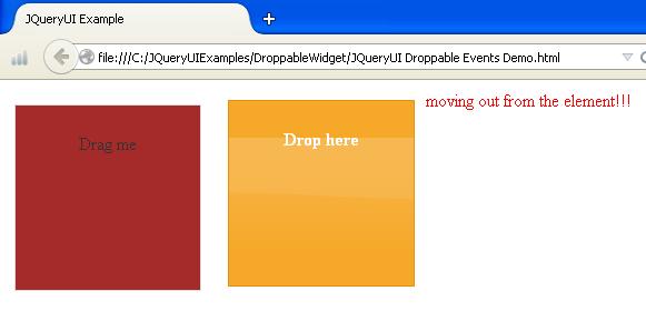
The following example demonstrates usage of events:
<!DOCTYPE html>
<head>
<link href="http://code.jquery.com/ui/1.10.4/themes/ui-lightness/jquery-ui.css" rel="stylesheet">
<script src="http://code.jquery.com/jquery-1.10.2.js"></script>
<script src="http://code.jquery.com/ui/1.10.4/jquery-ui.js"></script>
<style>
   #dragMe
   {
	   width: 150px;
	   height: 150px;
	   padding:0.5em;
	   background:brown;
	   float:left;
	   text-align:center;
	   margin:10px;
   }
   #dropMe
   {
	  width: 150px;
	  height:150px;
	  padding:0.5em;
	  float:left;
	  text-align:center;
	  margin:10px;
   }
</style>
</head>
<body>
   <div id="dragMe" class="ui-widget-content">
      <p>Drag me </p>
   </div>
   <div id="dropMe" class="ui-widget-header">
      <p>Drop here</p>
   </div>
   <div id="info" style="color:red;"></div>
<script>
$(function(){
   $("#dragMe").draggable();
   $("#dropMe").droppable({
      drop:function(event, ui){
         $("#info").html("dropped the element!!!");
      },
      over: function(event, ui){
         $("#info").html("moving in the element!!!");
      },
      out: function(event, ui){
         $("#info").html("moving out from the element!!!");
      }
   });
});
</script>
</body>
</html>
- The script uses events such as drop which activate when element is dropped on the element.
- The out event indicates that dragged element is dragged out of the droppable.
- The over event indicates that dragged element is dragged over the droppable.
Run JQueryUI Droppable Events Demo
 JQueryUI Resizable Widget