Chapter 2 Useful JavaScript and Dojo Tricks: This chapter explains Dojo’s approach to object-oriented programming with JavaScript.
Chapter 3 Basic Dijit Knowledge: Dijits is Dojo’s name for Widgets. A typical widget is a colorpicker or a movable pane. This chapter introduces Dijits in general and gives a lot of examples on how to use them, how they interact, and even an introduction to writing
your own.
Chapter 4 Ajax Communication: This chapter covers Ajax communication in several aspects, with examples, which also show the view from the server (in PHP code).
Chapter 5 Form-Related Dijits: This chapter focuses on serializing forms and powerful validation and Internationalization. It covers best practices when setting up Dojo forms and includes a run-down of available components.
Chapter 6 Layouts: The Layout Dijit organizes the content, be it other Dijits or plain HTML. This chapter shows a number of examples from simplifying layout in general with ‘CSS-less’ layout managers, to dynamic loading of content in content panes, and how to create a wizard widget with a StackContainer and a small amount of scripting.
Chapter 7 Data, Trees, and Grids: The datastores are perhaps the most complex area of Dojo, but they also give the programmer an unprecedented level of modularity. We’ll go over a couple of simple examples, then describe the dojo.data interface, how to extend
them, and how to use several different types of data in the same Dijit component.
Chapter 8 Real-World Dojo: This chapter is almost entirely examples, and focuses on giving the reader full-blown guides on how to create several types of applications with Dojo, and will also be a store for cut-and-paste problem solving when time is of essence.
Layout Widgets
The layout widgets in Dojo can often be alternatives to complicated CSS rules. Many times it is necessary to create pages with a two- or three-column layout, sometimes with a header and/or footer as well.
The layout manager widgets let you create powerful layouts without using more than a minimum of custom CSS styling. The layout managers have a lot of carefully laid-out styling that you can benefit from without having to interact with it. The BorderContainer makes sure that it has a proper margin to the widget it contains, as well as adding (removable) ‘gutter’ border lines for default clarity, for example. The TabContainer lets you programmatically choose if you want the tabs on top, bottom, left, or right without using any custom CSS, and so on.
This chapter will list a large number of layout widgets. Some are fully ‘official’, with accessibility support and internationalization. By the time of the writing this book, some will be experimental, and are found under the dojox directory.
Nevertheless, this book’s intent is to give you a smorgasboard of widgets, so that you know what you have available. One of the biggest challenges in learning Dojo is the sheer volume of the framework. In previous chapters, there were lists with short descriptions of useful Dijit widgets. The layout managers are too important and too complicated to be reduced to a mere sentence or two, which explains the volume of this chapter.
After the near-exhaustive expose of different layout managers and supporting acts, there will be a couple of longer examples which, with some luck, will give you some good practical points to elaborate upon.
Basic Dojo layout facts
The Layout widgets in Dojo are varied in nature, but their most common use is as ‘windows’ or areas which organize and present other widgets or information. Several use the same kind of child elements the ContentPane.
The ContentPane is a widget which can contain other widgets and plain HTML, reload content using Ajax and so on. The ContentPane can also be used stand-alone in a page, but is more usable inside a layout container of some sort.
And what is a layout container? Well, it’s a widget which contains ContentPanes, of course. A layout container can often contain other widgets as well, but most containers work very well with a different configuration of ContentPanes, which properly insulates the further contents.
Take the TabContainer, for example. It is used to organize two or more ContentPanes, where each gets its own tab. When a user clicks on one of the tabs, the ContentPane inside it is shown and all others are hidden.
Using BorderManager can bring the necessary CSS styling down to a minimum, while giving a simple interface for managing dynamic changes of child widgets and elements.
ContentPane
A ContentPane can look like anything of course, so it doesn’t really help putting a screen-dump of one on the page. However, the interface is very good to know.
The following arguments are detected by ContentPane and can be used when creating one either programmatically or by markup:
	// href: String
	//The href of the content that displays now.
	//Set this at construction if you want to load data externally
	//when the pane is shown.(Set preload=true to load it immediately.)
	//Changing href after creation doesn't have any effect;
	//see setHref();
	href: "",
	//extractContent: Boolean
	//Extract visible content from inside of <body> .... </body>
	  extractContent: false,
	//parseOnLoad: Boolean
	//parse content and create the widgets, if any
	  parseOnLoad:true,
	//preventCache: Boolean
	//Cache content retreived externally
	  preventCache:false,
	//preload: Boolean
	//Force load of data even if pane is hidden.
	  preload: false,
	//refreshOnShow: Boolean
	//Refresh (re-download) content when pane goes from hidden to shown
	  refreshOnShow: false,
	//loadingMessage: String
	//Message that shows while downloading
	loadingMessage: "<span class='dijitContentPaneLoading'>$
	{loadingState}</span>",
	//errorMessage: String
	//Message that shows if an error occurs
	errorMessage: "<span class='dijitContentPaneError'>${errorState}
	</span>",
You don’t need any of those, of course. A simple way to create a ContentPane would be:
var pane = new dojo.layout.ContentPane({});
And a more common example would be the following:
	var panediv = dojo.byId('panediv');
	var pane = new dojo.layout.ContentPane({ href: "/foo/content.html",
	preload: true}, panediv);
where we would have an element already in the page with the id ‘panediv’.
As you see, there are also a couple of properties that manage caching and parsing of contents. At times, you want your ContentPane to parse and render any content inside it (if it contains other widgets), whereas other times you might not (if it contains a source code listing, for instance).
You will see additional properties being passed in the creation of a ContentPane which are not part of the ContentPane itself, but are properties that give information specific to the surrounding Container. For example, the TabContainer wants to know which tab this is, and so on.
Container functions
All container widgets arrange other widgets, and so have a lot of common functionality defined in the dijit._Container class. The following functions are provided for all Container widgets:
- addChild: Adds a child widget to the container.
- removeChild: Removes a child widget from the container.
- destroyDescendants: Iterates over all children, calling destroy on each.
- getChildren: Returns an array containing references to all children.
- hasChildren: Returns a boolean.
LayoutContainer
The LayoutContainer is a widget which lays out children widgets according to one of five alignments: right, left, top, bottom, or client. Client means “whatever is left”, basically.
The widgets being organized need not be ContentPanes, but this is normally the case. Each widget then gets to set a layoutAlign property, like this:
layoutAlign = "left".
The normal way to use LayoutContainer is to define it using markup in the page, and then define the widgets to be laid out inside it.
LayoutContainer has been superceeded by BorderContainer, and will be removed in Dojo version 2.0.
SplitContainer
The SplitContainer creates a horizontal or vertical split bar between two or more child widgets.

	<div dojoType="dijit.layout.SplitContainer"
		orientation="vertical"
		sizerWidth="7"
		activeSizing="false"
		style="border: 1px solid #bfbfbf; float: left;
		margin-right: 30px; width: 400px; height: 300px;">
The SplitContainer must have a defined height and width. The orientation property is self-explanatory, as is sizerWidth. The property activeSizing means, if set to true, that the child widgets will be continually resized when the user changes the position of the sizer.
This can be bad if the child widgets are complex or access remote information to render themselves, in which case the setting can be set to false, as in the above example. Then the resize event will only be sent to the child widgets when the user stops.
Each child widget needs to define the sizeMin and sizeShare attributes. The sizeMin attribute defines the minimum size for the widget in pixels, but the sizeShare attribute is a relative value for the share of space this widget takes in relation to the other widget’s sizeShare values.
If we have three widgets inside the SplitPane with sizeShare values of 10, 40 and 50, they will have the same ratios in size as if the values had been 1:4:5.
StackContainer
The StackContainer hides all children widgets but only one at any given time, and is one of the base classes for both the Accordion and TabContainers.
StackContainer exists as a separate widget to allow you to define how and when the child widgets are shown. Maybe you would like to define a special kind of control for changing between child widget views, or maybe you want other events in your application to make the Container show specific widgets.
Either way, the StackContainer is one of the most versatile Containers, along with the BorderContainer.
The following functions are provided for interacting with the StackContainer:
- back – Selects and shows the previous child widget.
- forward – Selects and shows the next child widget.
- getNextSibling – Returns a reference to the next child widget.
- getPreviousSibling – Returns a reference to the previous child widget.
- selectChild – Takes a reference to the child widget to select and show.
- closeChild – If the widget is defined as closable, it will present a small x
icon, which will destroy the widget and remove it. This function does the
same programmatically.
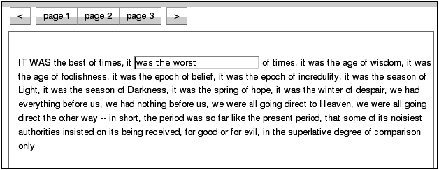
	<div id="myStackContainer" dojoType="dijit.layout.StackContainer"
		style="width: 90%; border: 1px solid #9b9b9b; height: 20em;
			margin: 0.5em 0 0.5em 0; padding: 0.5em;">
		<p id="page1" dojoType="dijit.layout.ContentPane" title=
		   "page 1">IT WAS the best of times, ....</p>
		<p id="page2" dojoType="dijit.layout.ContentPane" title=
		   "page 2">There were a king with a large jaw ...</p>
		<p id="page3" dojoType="dijit.layout.ContentPane" title=
		   "page 3">It was the year of Our Lord one thousand seven
			hundred and seventy- five. .../p>
	</div>
The StackContainer also publishes topics on certain events which can be caught using the messaging system. The topics are:
- [widgetId]-addChild
- [widgetId]-removeChild
- [widgetId]-selectChild
- [widgetId]-containerKeyPress
Where [widgetId] is the id of this widget. So if you had a StackContainer defined in the following manner:
	<div id="myStackContainer" dojoType="dijit.layout.StackContainer">
	...
	</div>
You can use the following code to listen to events from your StackContainer:
	dojo.subscribe("myStackContainer-addChild", this, function(arg)
	{
		var child = arg[0];
		var index = arg[1];
	});
Compare with the following code from the StackContainer class itself:
	addChild: function(/*Widget*/ child, /*Integer?*/ insertIndex)
	{
		// summary: Adds a widget to the stack
		this.inherited(arguments);
		if(this._started)
		{
			// in case the tab titles have overflowed from one line
			// to two lines
			this.layout();
			dojo.publish(this.id+"-addChild", [child, insertIndex]);
			// if this is the first child, then select it
			if(!this.selectedChildWidget)
			{
				this.selectChild(child);
			}
		}
	},
Also declared in the class file for the StackContainer is the dijit.layout. StackController. This is a sample implementation of a separate widget which presents user controls for stepping forward, backward, and so on in the widget stack.
What differentiates this widget from the Tabs in the TabContainer, for example, is that the widget is completely separate and uses the message bus to listen to events from the StackContainer. You can use it as-is, or subclass it as a base for you own controllers.
But naturally, you can build whatever you want and connect the events to the forward() and back() function on the StackContainer.
It’s interesting to note that at the end of the files that define StackContainer, the _Widget base class for all widgets is extended in the following way:
	//These arguments can be specified for the children of a
	//StackContainer.
	//Since any widget can be specified as a StackContainer child,
	//mix them into the base widget class. (This is a hack, but it's
	//effective.)
	dojo.extend(dijit._Widget, {
		//title: String
		//Title of this widget.Used by TabContainer to the name the tab, etc.
		title: "",
		//selected: Boolean
		//Is this child currently selected?
		selected: false,
		//closable: Boolean
		//True if user can close (destroy) this child, such as
		//(for example) clicking the X on the tab.
		closable: false, //true if user can close this tab pane
		onClose: function(){
			//summary: Callback if someone tries to close the child, child
			//will be closed if func returns true
			return true;
		}
	});
This means that all child widgets inside a StackContainer (or Tab or AccordionContainer) can define the above properties, which will be respected and used accordingly. However, since the properties are applied to the _Widget superclass they are of course now generic to all widgets, even those not used inside any containers at all.
The most commonly used property is the closable property, which adds a close icon to the widget and title, which defines a title for the tab.
A lot of Dijits respond to keypress events, according to WAI rules. Let’s look at the code that is responsible for managing key events in StackContainer and all its descendants:
	onkeypress: function(/*Event*/ e){
		//summary:
		//Handle keystrokes on the page list, for advancing to
		next/previous button
		//and closing the current page if the page is closable.
		if(this.disabled || e.altKey ){ return; }
		var forward = null;
		if(e.ctrlKey || !e._djpage){
			var k = dojo.keys;
			switch(e.charOrCode){
				case k.LEFT_ARROW:
				case k.UP_ARROW:
					if(!e._djpage){ forward = false; }
					break;
				case k.PAGE_UP:
					if(e.ctrlKey){ forward = false; }
					break;
				case k.RIGHT_ARROW:
				case k.DOWN_ARROW:
					if(!e._djpage){ forward = true; }
					break;
				case k.PAGE_DOWN:
					if(e.ctrlKey){ forward = true; }
					break;
				case k.DELETE:
					if(this._currentChild.closable)
					{
						this.onCloseButtonClick(this._currentChild);
					}
					dojo.stopEvent(e);
					break;
				default:
					if(e.ctrlKey){
						if(e.charOrCode == k.TAB)
						{
							this.adjacent(!.shiftKey).onClick();
							dojo.stopEvent(e);
						}
						else if(e.charOrCode == "w")
						{
							if(this._currentChild.closable)
							{
								this.onCloseButtonClick(this._currentChild);
							}
							dojo.stopEvent(e); // avoid browser tab closing.
						}
					}
				}
				// handle page navigation
				if(forward !== null)
				{
					this.adjacent(forward).onClick();
					dojo.stopEvent(e);
				}
			}
		},
The code is a very good example on how to handle key press events in Dojo in its own right, but for our purposes we can summarize in the following way:
- If UP, LEFT, or SHIFT+TAB is pressed, forward is set to false, and the last block of code will use that as an argument to the adjacent function which returns the prior child widget if false and the next child widget if true. In this case, the former.
- If DOWN , RIGHT, or TAB is pressed, forward will be set to true, which will declare the next child widget to be activated and shown.
- If DELETE or w is pressed and the current child widget is closable, it will be destroyed.
TabContainer
The TabContainer, which derives from StackContainer, organizes all its children into tabs, which are shown one at a time.
As you can see in the picture below, the TabContainer can also manage hierarchical versions of itself.
The TabContainer takes an argument property called tabPosition, which controls where the tab icons are displayed for each tab. Possible values are “top”, “bottom”, “left-h”, “right-h”, with “top” as default.

AccordionContainer
The AccorionContainer shows a horizontal bar for each added child widget, which represents its collapsed state. The bar acts as a tab and also holds the title defined for the child widget.
When the bar is clicked, an animation hides the current widget, and also animates in the widget whose bar was clicked.
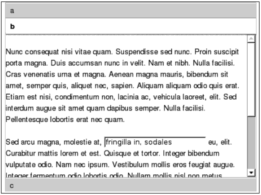
	<div dojoType="dijit.layout.AccordionContainer"
		style="width: 400px; height: 300px; overflow: hidden">
		<div dojoType="dijit.layout.AccordionPane" title="a">
			Hello World
		</div>
		<div dojoType="dijit.layout.AccordionPane" title="b">
			<p>
				Nunc consequat nisi...
			</p>
			<p>
				Sed arcu magna...
			</p>
		</div>
		<div dojoType="dijit.layout.AccordionPane" title="c">
			<p>The quick brown fox jumps over the lazy dog. The quick
				brown fox jumps over the lazy dog. The quick brown fox
				jumps over the lazy dog.</p>
		</div>
	</div>
A funny thing about the AccordionContainer is that it requires not any old widget as a child node, but its own AccordionPane, as you see in the code above.
However, the AccordionPane has ContentPane as superclass, and defines itself slightly differently due to the special looks of an accordion.
Also, the AccordionPane does not currently support nested Layout widgets, even though single-level widgets are supported.
BorderContainer
The BorderContainer has replaced the functionality of both LayoutContainer and SplitContainer.
Note that the outermost BorderContainer widget does not carry any layout information. This is instead delegated to each individual widget.
As each child gets added to the BorderContainer, the layout is recalculated. Using the BorderContainer is a very good alternative to using CSS-based “tableless tables”. For using the BorderContainer, you don’t need any other rules, and the Container recalculates positioning automatically, without the need for additional CSS rules (except for the height/width case below) each time you add an element or widget to the area.
Since BorderContainer widget replaces both SplitContainer and LayoutContainer, it both lets its child widgets declare where they are in relation to each other. Optionally, add resizing splitter between children.
Also, instead of optionally declaring one child as “client”, one child must now always be declared as “center”. For some reason, the child widget now use region, instead of layoutAlign, so a child widget which would have been defined like this in LayoutContainer:
<div dojoType="dijit.layout.ContentPane" layoutAlign="top">...</div>
is now defined like this instead:
<div dojoType="dijit.layout.ContentPane" region="top">...</div>
All “side” widgets must define a width, in style, by CSS class or otherwise, and the same applies for top/bottom widgets, but with height. Center widgets must not declare either height or width, since they use whatever is left over from the other widgets.
You can also use leading and trailing instead of right and left. The only difference is that when you change locale to a region that has text going from right to left (like Arabic and many others), this will arrange the widgets appropriate to the locale.
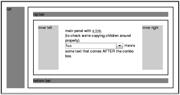
The BorderContainer also takes an optional design property, which defines if the BorderContainer is a headline or sidebar. The headline is the default and looks like the picture below. headline means that the top and bottom widgets extend the full length of the container, whereas sidebar means the the right and left (or leading and trailing) widgets extend top to bottom.
The sizeShare attribute for the ContentPanes used in the SplitContainer is deprecated in BorderContainer. All ContentPanes sizes are defined using regular techniques (direct stylin, classes, and so on).
From the BorderContainer test located in dijit/tests/layout/test_BorderContainer_nested.html, we find the following layout:
	<div dojoType="dijit.layout.BorderContainer"
		style="border: 2px solid black; width: 90%; height: 500px;
		padding: 10px;">
		<div dojoType="dijit.layout.ContentPane" region="left"
		  style="background-color: #acb386; width: 100px;">
			left
		</div>
		<div dojoType="dijit.layout.ContentPane" region="right"
		  style="background-color: #acb386; width: 100px;">
			right
		</div>
		<div dojoType="dijit.layout.ContentPane" region="top"
		  style="background-color: #b39b86; height: 100px;">
			top bar
		</div>
		<div dojoType="dijit.layout.ContentPane" region="bottom"
		  style="background-color: #b39b86; height: 100px;">
			bottom bar
		</div>
		<div dojoType="dijit.layout.ContentPane" region="center"
		  style="background-color: #f5ffbf; padding: 0px;">
			<div dojoType="dijit.layout.BorderContainer" design="sidebar"
			  style="border: 2px solid black; height: 300px;">
				<div dojoType="dijit.layout.ContentPane" region="left"
				  style="background-color: #acb386; width: 100px;">
					left
				</div>
				<div dojoType="dijit.layout.ContentPane" region="right"
				  style="background-color: #acb386; width: 100px;">
					right
				</div>
				<div dojoType="dijit.layout.ContentPane" region="top"
				  style="background-color: #b39b86; height: 100px;">
					top bar
				</div>
				<div dojoType="dijit.layout.ContentPane" region="bottom"
				  style="background-color: #b39b86; height: 100px;">
					bottom bar
				</div>
				<div dojoType="dijit.layout.ContentPane" region="center"
				  style="background-color: #f5ffbf; padding: 10px;">
					main panel with <a href="http://www.dojotoolkit.org/">
					a link</a>.<br />
					(to check we're copying children around properly).
					<br />
					<select dojoType="dijit.form.FilteringSelect">
						<option value="1">foo</option>
						<option value="2">bar</option>
						<option value="3">baz</option>
					</select>
					Here's some text that comes AFTER the combo box.
				</div>
			</div>
		</div>
	</div>
You see here the recurring theme of using ContentPanes inside Containers. Also, the innermost “center” ContentPane wraps a new BorderContainer which has its own internal top/left layout widgets.
Depending on what kind of application you are building, the BorderContainer might be a good starting point. Since you already know that you can change and reload the contents of individual ContentPanes, you are left with a layout in which each element can function as a lightweight Iframe with none of the negative side effects.
DragPane
The DragPane is a very simple idea. You have a very large area of elements to display, and want to let the user ‘drag’ the underlying pane around using the mouse.
The DragPane can be used in instances where you have a lot of pictures to present. It can also be used to present text or other widgets that are too numerous to fit in your current designated area of screen real estate.
The only property of DragPane is invert, which if set to true, inverts the axis of the drag of the mouse.
Example:
	<div class="hugetext" id="container" invert="false" dojoType="dojox.
		layout.DragPane">
		<p style="color:#666; padding:8px; margin:0;">
		Lorem ipsum dolor sit amet, consectetuer adipiscing elit.
		In porta. Etiam mattis libero nec ante. Nam
		porta lacus eu ligula. Cras mauris. Suspendisse vel augue.
		Vivamus aliquam orciut eros. Nunc eleifend
		sagittis turpis. purus purus in nibh. Phasellus in nunc.
		</p>
	</div>
ExpandoPane
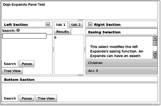
The ExpandoPane is an experimental (in 1.2) dynamic version of the ContentPane for use in BorderContainers.
It can expand or collapse on command, like an AccordionPane, but supports LayoutManagers as children widgets, and can be put anywhere a ContentPane would be inside the BorderContainer. It supports the resize bars that come with the BorderContainer and remembers the position of each after a minimize/ maximize animation.
In the example below, the top-level BorderContainer has been populated by a number of normal ContentPanes, and a number of ExpandoPanes. To the right and left are panes which have the tell tale ![]() icons of the ExpandoPanes, which inform the user that they can be minimized.
icons of the ExpandoPanes, which inform the user that they can be minimized.
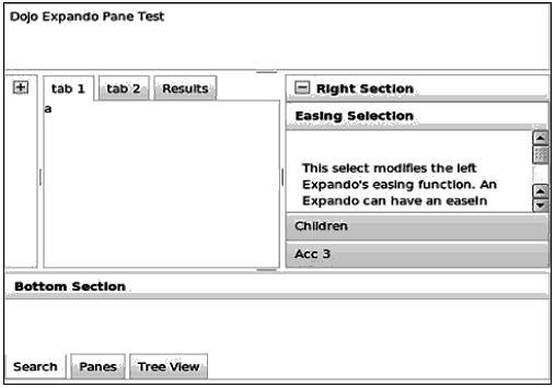
	<div dojoType="dojox.layout.ExpandoPane"
		splitter="true"
		duration="125"
		region="left"
		title="Left Section"
		id="leftPane"
		maxWidth="275"
		style="width: 275px;">
	</div>
The properties you can pass to an ExpandoPane shows some interesting stuff:
	maxHeight: "",
	maxWidth: "",
	splitter: "",
	_showing: true,
	//easeOut: String|Function
	//easing function used to hide pane
	easeOut: "dojo._DefaultEasing",
	//easeIn: String|Function
	//easing function use to show pane
	easeIn: "dojo._DefaultEasing",
	//duration: Integer
	//duration to run show/hide animations
	duration: 420,
	startExpanded: true,
The maxHeight, maxWidth, and splitter (true/false) are fairly self-explanatory. The duration variable means the duration of the max/min animations.
The fun part here is that Dojo has a very rich animation system that can be used for a variety of purposes. There’s a default ‘easing’ animation which provides a smooth extrapolation between start and stop coordinates.
If you want, you could change the easeIn or easeOut animation to something quicker or quirkier.
Further down in the code for ExpandoPane.js, we see the following:
	if(dojo.isString(this.easeOut))
	{
		this.easeOut = dojo.getObject(this.easeOut);
	}
	if(dojo.isString(this.easeIn))
	{
		this.easeIn = dojo.getObject(this.easeIn);
	}
This means that the animations will be left alone if they are not strings. If they are, the objects they represent will be loaded instead.
So what kind of easing animations exist, and how do we roll our own? That will be covered in later chapters, but if you’re curious, take a sneak peek at the file dojo/fx/easing.js, which contains functions such as linear, quartInOut, SineIn, elasticOut, and others.
FloatingPane
The FloatingPane is the obligatory ‘window’ widget, which can be dragged around like a desktop window and expanded or minimized.
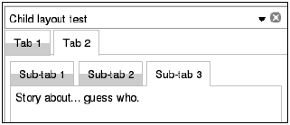
The basic example above shows only a ‘close’ icon, but more are supported. You can set the following properties when defining a FloatingPane:
	//closable: Boolean
	//Allow closure of this Node
	closable: true,
	//dockable: Boolean
	//Allow minimizing of pane if true
	dockable: true,
	//resizable: Boolean
	//Allow resizing of pane true if true
	resizable: false,
	//maxable: Boolean
	//Horrible param name for "Can you maximize this floating pane?"
	maxable: false,
	//resizeAxis: String
	//One of: x | xy | y to limit pane's sizing direction
	resizeAxis: "xy",
	//title: String
	//Title to use in the header
	title: "",
	//dockTo: DomNode?
	//if empty, will create private layout.Dock that scrolls with
	//viewport
	//on bottom span of viewport.
	dockTo: "",
	//duration: Integer
	//Time is MS to spend toggling in/out node
	duration: 400,
Setting Boolean to the closable property gives rise to the close icon, as dockable and maxable creates minimize and maximize icons respectively. You also see a dockTo property which makes it possible for you to define an element of your own where the pane minimizes and iconifies when the minimize icon is clicked.
The resizable property adds, if true, a ResizeHandle to the pane, which is more or less expected of windows in this day and age. And the resizeAxis, as the name implies, can restrict resizing to one or none of the two axes.
The duration property is, as you can see in the comments, the time spent in in/out animations for docking operations.
GridContainer
There are a lot of sites available that let you add a lot of rss feeds and assorted widgets to a personal page, and which then also let you arrange them by dragging the widgets themselves around the page.
One of the most known examples is iGoogle, Google’s personal homepage for users with a staggering amount of widgets that are easy to move around.

- The GridContainer defines a number of different columns, called zones.
- Each column can contain any number of child widgets, including other containers (like AccordionContainer or BorderContainer).
- Each child widget becomes draggable and can be dragged into a new position within its own column, or dragged to a new position in another column.
- As the widget gets dragged, it uses a semi-transparent ‘avatar’.
- As the widget gets dragged, possible target drop zones open up and close themselves dynamically under the cursor, until the widget is dropped on one of them.
- When a widget is dropped, the target column automatically rearranges itself to make the new widget fit.
Here is an example from test_GridContainer.html in /dojox/layout/tests/.This is what the GridContainer looks like from the beginning:
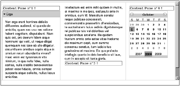
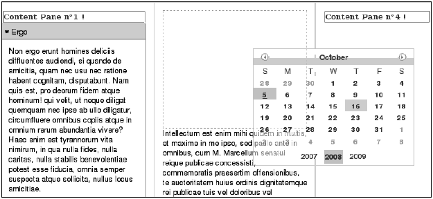
Finally, the widget is dropped onto the second column, both the source and target column arrange their widgets according to whether one has been added or removed.
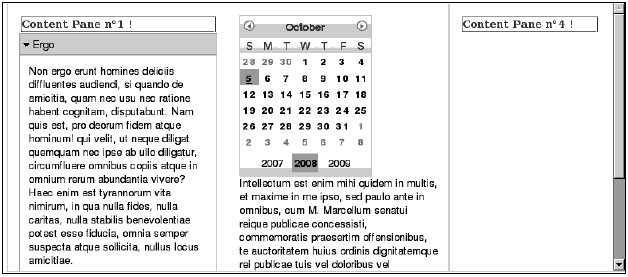
- An inter nal “dashboard” for management or other groups in the company which needs rearrangeable views on different data sources. Portlets done right.
- Using dojox.charting to create different diagrammatic views on data sources read from the server, letting the user create new diagrams and rearranging them in patterns or groups meaningful to the current viewer.
- A simple front-end for a CMS-system, where the editor widget is used to enter text, and the user can add, delete or change paragraphs as well as dragging them around and rearranging their order.
An example of how to create a GridContainer using markup (abbreviated) is as follows:
	<div id ="GC1" dojoType="dojox.layout.GridContainer"
		nbZones="3"
		opacity="0.7"
		allowAutoScroll="true"
		hasResizableColumns="false"
		withHandles="true"
		acceptTypes="dijit.layout.ContentPane, dijit.TitlePane,
		dijit.ColorPalette, dijit._Calendar">
		<div dojoType="dijit.layout.ContentPane" class="cpane" label="Content
			Pane">Content Pane n?1 !</div>
		<div dojoType="dijit.TitlePane" title="Ergo">
			Non ergo erunt homines deliciis ...
		</div>
		<div dojoType="dijit.layout.ContentPane" class="cpane" label="Content
			Pane">Content Pane n?2 !</div>
		<div dojoType="dijit.layout.ContentPane" title="Intellectum">
			Intellectum est enim mihiquidem in multis, et maxime in me ipso, sed
			paulo ante in omnibus, cum M....
		</div>
		<div dojoType="dijit.layout.ContentPane" class="cpane" label="Content
			Pane">Content Pane n?3 !</div>
		<div dojoType="dijit.layout.ContentPane" class="cpane" label="Content
			Pane">Content Pane n?4 !</div>
		<div dojoType="dijit._Calendar"></div>
	</div>
The GridContainer wraps all of its contents.These are not added is not added in a hierarchical manner, but instead all widgets are declared inside the GridContainer element. When the first column’s height is filled, the next widget in the list gets added to the next column, and so on.
This is a quite unusual method of layout, and we might see some changes to this mode of layout since the GridContainer is very much beta [2008].
The properties for the GridContainer are the following:
	// i18n: Object
	//Contain i18n ressources.
	i18n: null,

	//isAutoOrganized: Boolean:
	//Define auto organisation of children into the grid container.
	isAutoOrganized : true,

	//isRightFixed: Boolean
	//Define if the right border has a fixed size.
	isRightFixed:false,

	//isLeftFixed: Boolean
	//Define if the left border has a fixed size.
	isLeftFixed:false,

	//hasResizableColumns: Boolean
	//Allow or not resizing of columns by a grip handle.
	hasResizableColumns:true,

	//nbZones: Integer
	//The number of dropped zones.
	nbZones:1,
	//opacity: Integer
	//Define the opacity of the DnD Avatar.
	opacity:1,
	//minColWidth: Integer
	//Minimum column width in percentage.
	minColWidth: 20,
	//minChildWidth: Integer
	//Minimun children with in pixel (only used for IE6 that doesn't
	//handle min-width css property
	minChildWidth : 150,
	//acceptTypes: Array
	//The gridcontainer will only accept the children that fit to
	//the types.
	//In order to do that, the child must have a widgetType or a
	//dndType attribute corresponding to the accepted type.
	acceptTypes: [],
	//mode: String
	//location to add columns, must be set to left or right(default)
	mode: "right",
	//allowAutoScroll: Boolean
	//auto-scrolling enable inside the GridContainer
	allowAutoScroll: false,
	//timeDisplayPopup: Integer
	//display time of popup in miliseconds
	timeDisplayPopup: 1500,
	//isOffset: Boolean
	// if true : Let the mouse to its original location when moving
	//(allow to specify it proper offset)
	//if false : Current behavior, mouse in the upper left corner of
	//the widget
	isOffset: false,
	//offsetDrag: Object
	//Allow to specify its own offset (x and y) onl when Parameter
	//isOffset is true
	offsetDrag : {}, //
	//withHandles: Boolean
	//Specify if there is a specific drag handle on widgets
	withHandles: false,
	//handleClasses: Array
	//Array of classes of nodes that will act as drag handles
	handleClasses : [],
The property isAutoOrganized, which is set to true by default, can be set to false, which will leave holes in your source columns, and require you to manage the space in the target columns yourself.
The opacity variable is the opacity for the ‘avatar’ of the dragged widget, where 1 is completely solid, and 0 is completely transparent.
The hasResizableColumns variable also adds SplitContainer/BorderContainer splitters between columns, so that the user can change the size ratio between columns.
The minColWidt/minChildWidth variables manage the minimum widths of columns and child widgets in relation to resizing events.
The AcceptTy pes variable is an important property, which lets you define which classes you allow to be dropped on a column. In the above example code, that string is set to dijit.layout.ContentPane, dijit.TitlePane, dijit.ColorPalette, dijit._Calendar. This makes it impossible to drop an AccordionContainer on a column.
The reason for this is that certain things would want to be fixed, like status bars or menus, but still inside one of the columns.
The withHandles variable can be set to true if you want each widget to get a visible ‘drag handle’ appended to it.
RadioGroup
The source code of dojox.layout.RadioGroup admits that it probably is poorly named, because it has little to do with radio buttons or groups of them, per se, even if this was probably the case when it was conceived.
The RadioGroup extends the StackContainer, doing something you probably had ideas about the first time you saw it – adding fl ashy animations when changing which child container is shown.
One example of how to use StackContainer and its derivatives is an information box for a list of friends. Each information box is created as a ContentPane which loads its content from a URL. As the user clicks on or hovers over the next friend on a nearby list, an event is triggered to show the next item (ContentPane) in the stack.
Enter the RadioGroup, which defines its own set of buttons that mirror the ContentPanes which it wraps.
The unit test dojox/layout/tests/test_RadioGroup.html defines a small RadioGroup in the following way:
	<div dojoType="dojox.layout.RadioGroup" style="width:300px;
		height:300px; float:left;" hasButtons="true">
		<div dojoType="dijit.layout.ContentPane" title="Dojo" class="dojoPane"
			style="width:300px; height:300px; "></div>
		<div dojoType="dijit.layout.ContentPane" title="Dijit"
			class="dijitPane" style="width:300px; height:300px; "></div>
		<div dojoType="dijit.layout.ContentPane" title="Dojox"
			class="dojoxPane" style="width:300px; height:300px; "></div>
	</div>
As you can see, it does not take much space. In the test, the ContentPanes are filled with only the logos for the different parts of Dojo, defined as background images by CSS classes.
The RadioGroup iterates over each child ContentPane, and creates a “hover button” for it, which is connected to an event handler which manages the transition, so if you don’ t have any specific styling for your page and just want to get a quick mock-up done, the RadioGroup is very easy to work with.
The default RadioGroup works very much like its parent class, StackContainer, mostly providing a simple wrapper that generates mouseover buttons.
In the same file that defines the basic RadioGroup, there are two more widgets: RadioGroupFade and RadioGroupSlide. These have exactly the same kind of markup as their parent class, RadioGroup.
RadioGroupFade looks like this in its entirety:
	dojo.declare("dojox.layout.RadioGroupFade",
	dojox.layout.RadioGroup,
	{
		// summary: An extension on a stock RadioGroup, that fades the
		//panes.
		_hideChild: function(page){
			// summary: hide the specified child widget
			dojo.fadeOut({
				node:page.domNode,
				duration:this.duration,
				onEnd: dojo.hitch(this,"inherited", arguments)
			}).play();
		},
		_showChild: function(page){
			// summary: show the specified child widget
			this.inherited(arguments);
			dojo.style(page.domNode,"opacity",0);
			dojo.fadeIn({
				node:page.domNode,
				duration:this.duration
			}).play();
		}
	});
As you can see, all it does is override two functions from RadioGroup which manage how to show and hide child nodes upon transitions.
The basic idea is to use the integral Dojo animations fadeIn and fadeOut for the effects.
The other class, RadioGroupSlide, is a little bit longer, but not by much. It goes beyond basic animations and uses a specific easing function. In the beginning of its definition is this variable:
	// easing: Function
	// A hook to override the default easing of the pane slides.
	easing: "dojo.fx.easing.backOut",
Later on, in the overridden _hide and _showChild functions, this variable is used when creating a standalone animation:
	...
	this._anim = dojo.animateProperty({
		node:page.domNode,
		properties: {
			left: 0,
			top: 0
		},
		duration: this.duration,
		easing: <b>this.easing,</b>
		onEnd: dojo.hitch(page,function(){
			if(this.onShow){ this.onShow(); }
			if(this._loadCheck){ this._loadCheck(); }
		})
	});
	this._anim.play();
What this means is that it is very simple to change (once again) what kind of animation is used when hiding the current child and showing next, which can be very usable.
Also, you can see that it is very simple to create your own subclass widget out of RadioGroup which can use custom actions when child nodes are changed.
ResizeHandle
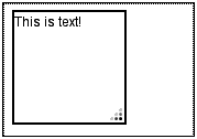
The ResizeHandle tucks a resize handle, as the name implies, into the corner of an existing element or widget.
	<div dojoType="dijit.layout.ContentPane" title="Test window"
		style="width: 300px; height: 200px; padding:10px; border: 1px solid
		#dedede; position: relative; background: white;" id="testWindow">
		...
		<div id="hand1" dojoType="dojox.layout.ResizeHandle"
			targetId="testWindow"></div>
In this example, a simple ContentPane is defined first, with some custom styling to make it stand out a little bit. Further on in the same pages comes a ResizeHandle definition which sets the targetId property of the newly created ResizeHandle to that of the ContentPane (‘testWindow’).
The definition of the ResizeHandle class shows some predictable goodies along with one or two surprises:
	//targetContainer: DomNode
	//over-ride targetId and attch this handle directly to a
	//reference of a DomNode
	targetContainer: null,
	//resizeAxis: String
	//one of: x|y|xy limit resizing to a single axis, default to xy ...
	resizeAxis: "xy",
	//activeResize: Boolean
	//if true, node will size realtime with mouse movement,
	//if false, node will create virtual node, and only resize target
	//on mouseUp.
	activeResize: false,
	//activeResizeClass: String
	//css class applied to virtual resize node.
	activeResizeClass: 'dojoxResizeHandleClone',
	//animateSizing: Boolean
	//only applicable if activeResize = false. onMouseup, animate the
	//node to the new size.
	animateSizing: true,
	//animateMethod: String
	//one of "chain" or "combine" ... visual effect only.
	combine will "scale"
	//node to size, "chain" will alter width, then height
	animateMethod: 'chain',
	//animateDuration: Integer
	//time in MS to run sizing animation. if animateMethod="chain",
	//total animation playtime is 2*animateDuration.
	animateDuration: 225,
	//minHeight: Integer
	//smallest height in px resized node can be
	minHeight: 100,
	//minWidth: Integer
	//smallest width in px resize node can be
	minWidth: 100,
As could be expected, it is simple to change if the resizing is animated during mouse move or afterwards (activeResize: true/false). If afterwards, the animateDuration declares in milliseconds the length of the animation.
A very useful property is the ability to lock the resizing action to just one of the two axes. The resizeAxis property defaults to xy, but can be set to only x or only y as well. Both restricts resizing to only one axis and also changes the resize cursor to show correct feedback to which axis is ‘active’ at the moment.
If you at any point want to remove the handle, calling destroy() on it will remove it from the target node without any repercussions.
RotatorContainer
The RotatorContainer is yet another useful derivative of StackContainer, which implements a slideshow-like functionality. Each child (typically, ContentPanes) can set a custom transitionDelay property, which changes the time it is shown. Otherwise, the centrally configured transitionDelay on the RotatorContainer itself controls how long each child is shown.

	<div dojoType="dojox.layout.RotatorContainer" id="myRotator"
		showTabs="true" autoStart="true" transitionDelay="5000">
		<div id="pane1" dojoType="dijit.layout.ContentPane" title="1">
			Pane 1!
		</div>
		<div id="pane2" dojoType="dijit.layout.ContentPane" title="2">
			Pane 2!
		</div>
		<div id="pane3" dojoType="dijit.layout.ContentPane"
			title="3" transitionDelay="10000">
			Pane 3 with overrided transitionDelay!
		</div>
	</div>
The file the defines the RotatorContainer also defines a widget called RotatorPager, which can act as a kind of remote-control for a given RotatorContainer.
In the picture above, there are two RotatorPagers, each with a different look. The undermost is defined like this:
	<div dojoType="dojox.layout.RotatorPager" class="rotatorIcons"
		rotatorId="myRotator">
		<button dojoType="dijit.form.Button" iconClass="previous"
			dojoAttachPoint="previous">Prev</button>
		<button dojoType="dijit.form.ToggleButton"
			iconClass="playPause" dojoAttachPoint="playPause"></button>
		<button dojoType="dijit.form.Button" iconClass="next"
			dojoAttachPoint="next">Next</button>
		<span dojoAttachPoint="current"></span> /
		<span dojoAttachPoint="total"></span>
	</div>
The important thing here is the rotatorId property, which attaches the RotatorPager to a specific RotatorContainer.
Al so, very good use has been made of dojoAttachPoint. Instead of using dojo/connect script tags or more convoluted schemes of attaching behavior to controls, the widget simply uses the same kind of association used inside a template. But turning it inside out, allowing the user of the widget an elegant way to make almost any element a controller for a specific activity.
The possible attachPoints are (from source):
	//The pager can contain the following components:
	//* Previous button
	// - Must be a dijit.form.Button
	// - dojoAttachPoint must be named "previous"
	//* Next button
	// - Must be a dijit.form.Button
	// - dojoAttachPoint must be named "next"
	//* Play/Pause toggle button
	// - Must be a dijit.form.ToggleButton
	// - dojoAttachPoint must be named "playPause"
	// - Use iconClass to specify toggled state
	//* Current child #
	// - dojoAttachPoint must be named "current"
	//* Total # of children
	// - dojoAttachPoint must be named "total"
The last two attachPoints define spots where the RotatorContainer will display the current child being viewed, and the total number of children, respectively.
ScrollPane
The ScrollPane is again a variant of using mouseover to change widget state in a very intuitive manner.
Many times you have a list of things that isn’t broad or multifaceted enough to warrant a table-like Grid or a Tree, but you still want to present it somewhat orderly. Also, the list might be quite long and you would like to make it easy for people to browse around in it.
One simple solution is to use a regular div with overfl ow visible and a fixed height. The ScrollPane does away with a lot of details and just lets you present things and browse them by just moving the mouse over either of the active ends. If there are more items to show, the ScrollPane will scroll the remaining items in a natural speed into the viewing area.

The ScrollPane is very simple to use and can be created vertically as well.
In the future, we might see ScrollPanes that have separators based on the first letter of the title of items, and also creates a helper bar which is ordered in the same way.
The ScrollPane is created like this:
	<div dojoType="dojox.layout.ScrollPane" style="width:100px;
		height:300px; border:1px solid #b7b7b7">
		<ol class="list" id="vertList">
			<liid="cloneMe"><a href="#"><span>testItem</span></a></li>
		</ol>
	</div>
To get a horizontal ScrollPane, use the property orientation set to “horizontal”.
Compound example using layout
The following is a more complicated example which is a small information box for a fictitious adventure game. A lot of information is to be displayed in a small area:
- Adventurer status
- Characteristics
- Inventory
- Quests
Using the BorderLayout container for overall layout, it consists of three parts: a toolbar, an accordioncontainer, and a horizontal ScrollPane top display the inventory.
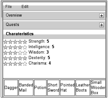
The source code for the example is here:
	<!DOCTYPE HTML PUBLIC "-//W3C//DTD HTML 4.01//EN" "http://www.w3.org/
		TR/html4/strict.dtd">
	<html>
	<head>
		<title>Chapter 6 Layout Example</title>
		<style>
			@import "dojo-1.1.0/dojo/resources/dojo.css";
			@import "dojo-1.1.0/dijit/tests/css/dijitTests.css";
			@import "dojo-1.1.0/dijit/themes/tundra/tundra.css";
			@import "dojo-1.1.0/dojox/widget/Rating/Rating.css";
		</style>
		<script type="text/javascript" src="dojo-1.1.0/dojo/dojo.js"
			djConfig="isDebug: true, parseOnLoad: true"></script>
		<script type="text/javascript">
			dojo.require("dijit.Menu");
			dojo.require("dijit.form.CheckBox");
			dojo.require("dijit.form.TextBox");
			dojo.require("dijit.layout.BorderContainer");
			dojo.require("dijit.layout.ContentPane");
			dojo.require("dijit.form.Button");
			dojo.require("dijit.Toolbar");
			dojo.require("dojox.widget.Rating");
			dojo.require("dojox.layout.ScrollPane");
			dojo.require("dijit.layout.AccordionContainer");
			dojo.require("dojo.parser");
			// scan page for widgets and instantiate them
		</script>
		<script>
			function handleMenu(m)
			{
				console.log("handleMenu called for menu '"+m+"'");
			}
		</script>
	</head>
	<body class="tundra">
		<div dojoType="dijit.layout.BorderContainer" style="border:
			1px solid black; height: 300px; width:300px;padding: 10px;">
			<div dojoType="dijit.layout.ContentPane" region="top">
				<div id="menubar" dojoType="dijit.Toolbar" class="menuBar">
					<div dojoType="dijit.form.DropDownButton">
						<span>File</span>
						<div dojoType="dijit.Menu">
							<div dojoType="dijit.MenuItem" onClick="handleMenu('New profile')">
								New Profile</div>
							<div dojoType="dijit.MenuItem" onClick="handleMenu('Open
								Profile')">Open Profile</div>
							<div dojoType="dijit.MenuSeparator"></div>
							<div dojoType="dijit.MenuItem" iconClass="dijitEditorIcon
								dijitEditorIconSave" onClick="handleMenu('Save Profile')">Save
								Profile</div>
							<div dojoType="dijit.MenuItem" onClick="handleMenu('Save Profile
								As..')">Save Profile As...</div>
						</div>
					</div>
					<div dojoType="dijit.form.DropDownButton">
						<span>Edit</span>
						<div dojoType="dijit.Menu">
							<div dojoType="dijit.MenuItem" iconClass="dijitEditorIcon
								dijitEditorIconCut" onClick="handleMenu('Cut')">Cut</div>
							<div dojoType="dijit.MenuItem" iconClass="dijitEditorIcon
								dijitEditorIconCopy" onClick="handleMenu('Copy')">Copy</div>
							<div dojoType="dijit.MenuItem" iconClass="dijitEditorIcon
								dijitEditorIconPaste" onClick="handleMenu('Paste')">Paste</div>
						</div>
					</div>
				</div>
			</div>
			<div dojoType="dijit.layout.ContentPane" region="center">
				<div dojoType="dijit.layout.AccordionContainer" style="height:
					210px; overflow: hidden">
					<div dojoType="dijit.layout.AccordionPane" title="Overview">
						Profile: <b>Foo Barsson</b><br/>
						Status: <b>Cool</b>
					</div>
					<div dojoType="dijit.layout.AccordionPane" title="Quests">
						<bl>
							<li>Defeat Giant Mouse in the Cellar of Hierloom House</li>
							<li>Find the Apple of Perfume for Fiona the Enchantress</li>
							<li>Collect six Emerald Centipedes</li>
						</bl>
					</div>
					<div dojoType="dijit.layout.AccordionPane" title="Charateristics">
						<span id="rating0" dojoType="dojox.widget.Rating" numStars="5" value
							= "5" onChange="dojo.query('#rating0Value')[0].innerHTML =
							this.value"></span>
							Strength: <b><span id="rating0Value">5</span></b>
						<br/>
						<span id="rating1" dojoType="dojox.widget.Rating" numStars="5" value
							= "4" onChange="dojo.query('#rating1Value')[0].innerHTML =
							this.value"></span>
							Intelligence: <b><span id="rating1Value">5</span></b>
							<br/>
						<span id="rating2" dojoType="dojox.widget.Rating" numStars="5" value
							= "2" onChange="dojo.query('#rating2Value')[0].innerHTML = this.
							value"></span>
							Wisdom: <b><span id="rating2Value">2</span></b>
							<br/>
						<span id="rating3" dojoType="dojox.widget.Rating" numStars="5"
							value = "5" onChange="dojo.query('#rating3Value')[0].innerHTML =
							this.value"></span>
							Dexterity: <b><span id="rating3Value">5</span></b>
							<br/>
						<span id="rating4" dojoType="dojox.widget.Rating" numStars="5"
							value = "4" onChange="dojo.query('#rating4Value')[0].innerHTML =
							this.value"></span>
							Charisma: <b><span id="rating4Value">4</span></b>
							<br/>
					</div>
				</div>
				<div dojoType="dojox.layout.ScrollPane" region="bottom"
					orientation="horizontal" style=" border:1px solid #b7b7b7">
					<table class="list" id="vertList">
					<tr>
						<td style="border:1px solid black;">Dagger</td>
						<td style="border:1px solid black;">Banded Mail</td>
						<td style="border:1px solid black;">Potion</td>
						<td style="border:1px solid black;">Short Sword</td>
						<td style="border:1px solid black;">Pointed Hat</td>
						<td style="border:1px solid black;">Leather Boots</td>
						<td style="border:1px solid black;">Small Wooden Box</td>
						<td style="border:1px solid black;">Steel Helmet</td>
						<td style="border:1px solid black;">6 Wooden Arrows</td>
						<td style="border:1px solid black;">Orc Teeth</td>
						<td style="border:1px solid black;">Wooden Staff</td>
						<td style="border:1px solid black;">Zircon Ring</td>
					</tr>
					</table>
				</div>
			</div>
		</div>
	</body>
	</html>
The Toolbar
The Toolbar is made up of two DropDown buttons, which add simple onclick handlers which call back to a single handler called handleMenu. As you can see, it is not particularly complicated, only logging the button which was clicked.
When using the Toolbar, it is very important to remember to use the ‘tundra’ class on the body element (or any other Dojo theme), since the toolbar effect is heavily dependent on the right classes.
The BorderContainer
When beginning a layout, it’s a good idea to begin with the container and the constituent ContentPanes, setting heights and widths as good as you can. It’s often hard to get the ratios right the very first time, so it’s beneficial using a ‘scaffolding’ layout with a minimum of other components while trying out which stylings are needed.
Another good idea is to use different glaring background colors for all ContentPanes, possibly also solid borders. This makes it easier to spot bugs in the design as quickly as possible.
The design used here uses only three parts: one “top” for the Toolbar, a “center” for the AccordionContainer, and a “bottom” for the Inverntory ScrollPane.
Ideally, the Inventory would have been a fourth tab on the AccordionPane, but since AccordionPane does not support other Layout Containers as children, it had to have its own ContentPane parallel to the AccordionContainer instead.
The AccordionContainer
Thre e different AccordionPanes were used, only one showing at a time, with a nice animation between changes. The central pane “Characteristics” uses a lot of Rating widgets. These are very effective at displaying values at a glance, and the ratings provide a simple example showing how to collect the changes to each widget.
The ScrollPane
The ScrollPane is like the AccordionContainer, a very good way to tuck away a lot of information that is still browseable in an intuitive manner. The adventurer has collected quite a few items, all of which do not fit in the allotted width for the BorderContainer. Moving the cursor to the right or left of the ScrollPane will pan hidden items into sight automatically.
Note that when using a “horizonal” layout for the ScrollPane, you must also provide the elements horizontally. If a list element would have been used instead of a table, the information would have been displayed vertically regardless.
One step forward—creating a widget
Now that the BorderContainer display works fine, we suddenly get a change of plans. No longer it is sufficient to display only one adventurer, instead we need to create any number of adventurers, possibly as separate windows.
Clearly, this is possible given the widgets we’ve already discussed in this chapter. But to create any number of adventurer profiles on screen, we need to reach back a couple of chapters and revisit how to create a Dijit.
Why a Dijit? Because we need to leverage Dojo to create a template out of the design above. This way we can create as many copies of it as we would like, without having to take care of specific ids, colliding global variables, and the like. Fortunately, creating a Dojo Widget out of a single mockup page is fairly simple.
First, we create a subdirectory for our project, which might contain more than one widget when we’re done. The best choice is to put this directory parallel to the other Dojo directories so that we can use dojo.require() for out new widget.
We will use the following structure:
dojo
dijit
dojox
adventure
	profile.js
	profile.html
	profile_test.html
So we create a directory called adventure and call the widget profile, with the definition residing inside the file profile.js. That file, in turn, points to the file profile.html as containing the html template for the widget.
The test file is a regular html file which contains an example test of the new widget:
	<!DOCTYPE HTML PUBLIC "-//W3C//DTD HTML 4.01//EN" "http://www.w3.org/
		TR/html4/strict.dtd">
	<html>
	<head>
		<title>Adventure Profile Test</title>
		<style>
			@import "../dojo/resources/dojo.css";
			@import "../dijit/themes/dijit.css";
			@import "../dijit/themes/tundra/tundra.css";
			@import "../adventure/profile.css";
			@import "../dojox/widget/Rating/Rating.css";
		</style>
		<script>
			djConfig=
			{
				isDebug: true,
				parseOnLoad: true
			}
		</script>
		<script type="text/javascript" src="../dojo/dojo.js"></script>
		<script type="text/javascript">
			dojo.require("dojo.parser");
			// scan page for widgets and instantiate them
			dojo.require("adventure.profile");
		</script>
	</head>
	<body class="tundra">
		<div dojoType="adventure.profile"
			name = "Foo Barsson"
			status = "OK"
			questinfo = "Defeat Giant Mouse in the Cellar of Hierloom
				House,Find the Apple of Perfume for Fiona the
				Enchantress,Collect six Emerald Centipedes"
			strength = "5"
			intelligence="4"
			wisdom="4"
			dexterity="5"
			charisma="4"
			inventory="Dagger,Banded Mail,Potion,Short Sword,Pointed
				Hat,Leather Boots,Small Wooden Box,Steel Helmet,6 Wooden
				Arrows,Orc Teeth,Wooden Staff,Zircon Ring" ></div>
		<br/>
		<div dojoType="adventure.profile"
			name = "Fighter Fightersson"
			status = "OK"
			questinfo = "Find Orcs,Kill Orcs,Find Entrance to
				Dungeon,Find Loot"
			strength = "5"
			intelligence="2"
			wisdom="3"
			dexterity="5"
			charisma="3"
			inventory="Cheese, Nails,Banded Mail,Potion,Long Sword,Brass
				Gauntlets,Leather Boots,Mithril Armor,Steel Helmet,Flask of
				Oil,Torch,Holy Handgrenade,Robe of Invisibility,Ruby Ring">
		</div>
	</body>
	</html>
The first step in creating a widget of a mockup page is to remove all data and either put it in separate files, to be loaded from data-driven components (more on this in next chapter), or given as arguments as we see above. Two instances of the newly created adventure.profile widget are put on the page, each with varying arguments. These will be inserted into the widget’s variables with the same names automagically.
Since the mockup used some static tables to lay out the data, I’ve opted to put the lists of things (like quests) into comma-separated strings. These are then parsed when the widget starts up and used as content of the requisite kind of markup created on the fl y and added to parent elements in the template.
The template for the widget is where most of the markup has gone. It looks mostly the same, with some crucial differences:
- All static ids on elements have either been removed, or augmented with ${id}. When adding ${id}, you take advantage of Dojo’s common templating mechanisms to insert the current Dom id of the widget’s top element, making the id unique in the page, regardless of how many instances of the widget are present.
- When possible, dojoAttachPoints have been added, where before unique id references were used to refer to elements and/or sub-widgets. When defining a dojoAttachPoint=”xxx” on an element, that name will then be accessible inside the JavaScript widget definition as this.xxx.
- All parts of the widget that display contents of variables replace the hard-coded values of the mockup with a ${} variable.
To illustrate the last point, the AccordionPane that shows the name and status of the adventurer now looks like this:
	<div dojoType="dijit.layout.AccordionPane" title="Overview">
		Profile: <b>${name}</b><br/>
		Status: <b>${status}</b>
	</div>
where name and status are arguments given in the markup creation of the widget.
An example of how to use attach points can be seen in the former ScrollPane declaration in the mockup, which now is just an ordinary element:
	<div dojoAttachPoint="inventorypane">
		<table>
			<tr dojoAttachPoint="inventoryRow">
			</tr>
		</table>
	</div>
Here is the complete template for the widget:
	<div>
		<div dojoType="dijit.layout.BorderContainer" style="border: 1px solid
			black; height: 300px; width:300px;padding: 10px;">
			<div dojoType="dijit.layout.ContentPane" region="top">
				<div dojoType="dijit.Toolbar" class="menuBar">
					<div dojoType="dijit.form.DropDownButton">
						<span>File</span>
						<div dojoType="dijit.Menu">
							<div dojoType="dijit.MenuItem" dojoAttachPoint=
								"new_profile">New Profile</div>
							<div dojoType="dijit.MenuItem" dojoAttachPoint="open_profile">
								Open Profile</div>
							<div dojoType="dijit.MenuSeparator"></div>
							<div dojoType="dijit.MenuItem" iconClass="dijitEditorIcon
								dijitEditorIconSave" dojoAttachPoint="save_profile">Save Profile
							</div>
							<div dojoType="dijit.MenuItem" dojoAttachPoint="save_profile_as">
								Save Profile As...</div>
						</div>
					</div>
					<div dojoType="dijit.form.DropDownButton">
						<span>Edit</span>
						<div dojoType="dijit.Menu">
							<div dojoType="dijit.MenuItem" iconClass="dijitEditorIcon
								dijitEditorIconCut" dojoAttachPoint="cut">Cut</div>
							<div dojoType="dijit.MenuItem" iconClass="dijitEditorIcon
								dijitEditorIconCopy" dojoAttachPoint="copy">Copy</div>
							<div dojoType="dijit.MenuItem" iconClass="dijitEditorIcon
								dijitEditorIconPaste" dojoAttachPoint="paste">Paste</div>
						</div>
					</div>
				</div>
			</div>
			<div dojoType="dijit.layout.ContentPane" region="center">
				<div dojoType="dijit.layout.AccordionContainer"
					style="height: 210px; overflow: hidden">
					<div dojoType="dijit.layout.AccordionPane" title="Overview">
						Profile: <b>${name}</b><br/>
						Status: <b>${status}</b>
					</div>
					<div dojoType="dijit.layout.AccordionPane" title="Quests">
						<bl dojoAttachPoint="quests"></bl>
					</div>
					<div dojoType="dijit.layout.AccordionPane" title="Charateristics">
						<span id="${id}rating0" dojoType="dojox.widget.Rating" numStars="5"
							value = "${strength}" onChange="dojo.byId('${id}rating0Value').
							innerHTML = this.value"></span>
							Strength: <b><span id="${id}rating0Value">${strength}</span></b>
						<br/>
						<span id="${id}rating1" dojoType="dojox.widget.Rating" numStars="5"
							value = "${intelligence}" onChange="dojo.byId('${id}rating1Value').
							innerHTML = this.value"></span>
							Intelligence: <b><span id="${id}rating1Value">${intelligence}
						</span></b>
						<br/>
						<span id="${id}rating2" dojoType="dojox.widget.Rating" numStars="5"
							value = "${wisdom}" onChange="dojo.byId('${id}rating2Value').
							innerHTML = this.value"></span>
							Wisdom: <b><span id="${id}rating2Value">${wisdom}</span></b>
						<br/>
						<span id="${id}rating3" dojoType="dojox.widget.Rating" numStars="5"
							value = "${dexterity}" onChange="dojo.byId('${id}rating3Value').
							innerHTML = this.value"></span>
							Dexterity: <b><span id="${id}rating3Value">${dexterity}</span></b>
						<br/>
						<span id="${id}rating4" dojoType="dojox.widget.Rating" numStars="5"
							value = "${charisma}" onChange="dojo.byId('${id}rating4Value').
							innerHTML = this.value"></span>
							Charisma: <b><span id="${id}rating4Value">${charisma}</span></b>
						<br/>
					</div>
				</div>
				<div dojoAttachPoint="inventorypane">
					<table>
						<tr dojoAttachPoint="inventoryRow">
						</tr>
					</table>
				</div>
			</div>
		</div>
	</div>
The rating widgets are a bit verbose in their definitions. One alternative would have been to create a separate customized subclass of the Rating widget, which managed its own update, to also show a number to the side.
We could also, of course, have managed the changes inside the logic of this widget as well.
In the file that defines the widget, the startup function reads both the quests and the inventory strings, which are split into an array and then used to populate the two parts of the widget that show variable amounts of data.
Here is the JavaScript for the widget definition:
	dojo.provide("adventure.profile");
	dojo.require("dijit._Templated");
	dojo.require("dijit._Widget");
	dojo.require("dijit.Dialog");
	dojo.require("dijit.Menu");
	dojo.require("dijit.layout.BorderContainer");
	dojo.require("dijit.layout.ContentPane");
	dojo.require("dijit.form.Button");
	dojo.require("dijit.Toolbar");
	dojo.require("dojox.widget.Rating");
	dojo.require("dojox.layout.ScrollPane");
	dojo.require("dijit.layout.AccordionContainer");
	dojo.declare("adventure.profile", [ dijit._Widget, dijit._Templated],
	{
		templatePath: dojo.moduleUrl("adventure","profile.html"),
		widgetsInTemplate: true,
		name: "none",
		status: "undefined",
		questinfo: "",
		strength: 0,
		intelligence: 0,
		wisdom: 0,
		dexterity: 0,
		charisma: 0,
		inventory: "",
		handleMenu: function(e)
		{
			var t = e.currentTarget.textContent;
			console.log("adventure.profile handleMenu called for "+t);
		},
		startup: function()
		{
			console.log("startup for adventure.profile called.");
			dojo.connect(this.new_profile, "onClick", this.handleMenu);
			dojo.connect(this.open_profile, "onClick", this.handleMenu);
			dojo.connect(this.save_profile, "onClick", this.handleMenu);
			dojo.connect(this.save_profile_as, "onClick", this.handleMenu);
			dojo.connect(this.cut, "onClick", this.handleMenu);
			dojo.connect(this.copy, "onClick", this.handleMenu);
			dojo.connect(this.paste, "onClick", this.handleMenu);
			var q = this.questinfo.split(",");
			for(var quest in q)
			{
				var li = dojo.doc.createElement('li');
				var span = dojo.doc.createElement('span');
				li.appendChild(span)
				span.innerHTML=q[quest];
				this.quests.appendChild(li);
			};
			var i = this.inventory.split(",");
			for(var it in i)
			{
				var td = dojo.doc.createElement('td');
				td.innerHTML=i[it];
				td.style.height = "30px;";
				td.style.border = "1px solid black";
				this.inventoryRow.appendChild(td);
			};
			var pane = new dojox.layout.ScrollPane(
			{
				region: "bottom",
				orientation: "horizontal"
			}, this.inventorypane);
			pane.startup();
		},
		postCreate: function()
		{
			console.log("postCreate for adventure.profile called.");
		}
	});
Note that we were able to move all the specific require statements from the html file where the widget is created, to the definition of the widget. This makes the use of the widget much simpler.
On the other hand, all specific CSS that the constituent parts of the widget need still needs to be included in the file where the widget is to be created by markup, so true transparency of resources is still a bit away.
Another important thing to reemphasize is that all arguments to be passed as variables from markup to widget need also be defined in the widget. If the widget variable name was to be deleted for some reason, that argument would not be carried over from markup to widget and will look “undefined” in the widget upon creation.
Summary
- Dojo has a variety of Layout Containers for arranging other components and markup.
- Most Layout Containers use ContentPanes which demarcate markup into content parcels, which are then arranged and rearranged in different manners.
- The content of a ContentPane can be static, loaded from a URL, or reloaded. Using Layout Containers make it simpler to arrange elements on the page.
- The RadioGroup LayoutContainer is a good component for simple site navigation, showing one HTML snippet at a time, using animated transitions.
- The FloatingPane acts as a classical “window” which can be resized, closed, dragged around, and even collapsed to a ‘docking’ element, for later expansion.

 Internationalization and Taglibs in Struts 1.2