
JBoss RichFaces 3.3JBoss RichFaces is a rich component library for JavaServer Faces and an AJAX framework that allows easy integration of Ajax capabilities into complex business applications. Do you wish to eliminate the time involved in writing JavaScript code and managing JavaScript-compatibility between browsers to build an Ajax web application quickly?
also read:
This book goes beyond the documentation to teach you how to do that. It will show you how to get the most out of JBoss RichFaces by explaining the key components and how you can use them to enhance your applications. Most importantly, you will learn how to integrate Ajax into your applications without using JavaScript, but only standard JSF components. You will learn how to create and customize your own components and add them to your new or existing applications.
First, the book introduces you to JBoss RichFaces and its components. It uses many examples of Ajax components which, among others, include: Calendar, Data Table, ToolTip, ToolBar, Menu, RichEditor, and Drag ‘n’ Drop. All these components will help you create the web site you always imagined. Key aspects of the RichFaces framework such as the Ajax framework, skinnability, and Component Development Kit (CDK) will help you customize the look of your web application. As you progress through the book, you will see a sample application that shows you how to build an advanced contact manager. You’re also going to be amazed to know about the advanced topics you will learn such as developing new components, new skins, optimizing a web application, inserting components dynamically using Java instead of XHTML, and using JavaScript to manage components. This book is more than a reference with component example code: it’s a manual that will guide you, step by step, through the development of a real Ajax JSF web application.
What This Book Covers
Chapter 1: What is RichFaces covers the aims of the RichFaces framework, its components, and what you can do by using it in a web application.
Chapter 2: Getting Ready explains how to configure your environment by creating a simple project using the seam-gen tool, adding support to Seam and Facelets, and the manual configuration for the RichFaces libraries. We will understand the IDE that we can
use while developing with the framework.
In Chapter 3: First Steps, you will learn to build Ajax applications by developing a simple example, the basics of RichFaces step by step, from creating the project to editing the code, using very important components and their Ajax properties.
Chapter 4: The Application covers how to create the basics of our project by having a look at the side technologies we might know, in order to build good applications. It will cover templating with Facelets, JBoss Seam authentication, and customization of the entities.
Chapter 5: Making the Application Structure explains us how to create the login and registration system of the website. We’ll look at all the features that a real application might have.
In Chapter 6: Making the Contacts List and Detail, we will develop the core feature of our application—contact management. We’ll learn about Ajax interaction and containers, and about new Ajax components that RichFaces offers.
Chapter 7: Finishing the Application explains how to finish building the application using the RichFaces components, and about customizing them.
In Chapter 8: Skin Customization, we’ll see all the powerful customization capabilities that the RichFaces framework offers.
Chapter 9: Creating a New plug ‘n’ skin covers how to create, customize, and package and deploy a new pluggable skin.
Chapter 10: Advanced Techniques explains you how to use and implement pushing, partial updates, and session expiration handling in order to develop advanced applications.
In Chapter 11: Component Development Kit, we’ll see how to start a project in order to develop a simple JSF Ajax component in a simple and effective way using the features the CDK offers.
Appendix: RichFaces Components Overview covers a list of all the components of RichFaces with their functionalities.
Skin Customization
We have finished our application and now we would like to customize its look to follow the style we like. In this chapter, we will see how to change the style of existing skins (using CSS and XCSS) and how to create a new personalized skin starting from the built-in skins that the RichFaces framework offers.
Skinnability
In the Chapter 1, First Steps, we read an introduction of what RichFaces skinnability is about, and during the development of our application, we’ve learned how to set the default skin for a project and even how to change it dynamically .
Summarizing, every RichFaces component gives the support for skinnability and it means that just by changing the skin, we change the look for all of the components. That’s very good for giving our application a consistent look and not repeating the same CSS values for each component every time.
RichFaces still uses CSS, but it also enhances it in order to make it simpler to manage and maintain.
Customize skin parameters
A skin file contains the basic settings (such as font, colors, and so on) that we’ll use for all the components—just by changing those settings, we can customize the basic look and feel for the RichFaces framework.
As you might know, RichFaces comes with some built-in skins (and other external plug ‘n’ skin ones)—you can start with those skins in order to create your own custom skin.
The built-in skins are:
- Plain
- emeraldTown
- blueSky
- wine
- japanCherry
- ruby
- classic
- deepMarine
The plug ‘n’ skin ones are:
- laguna
- darkX
- glassX
The plug ‘n’ skin skins are packaged in external jar files (that you can download from the same location as that of the RichFaces framework) that must be added into the project in order to be able to use them. We will see how to create our custom plug ‘n’
skin in the next chapter. Remember that the skin used by the application can be set as context-param in the
web.xml file:
	<context-param>
		<param-name>org.richfaces.SKIN</param-name>
		<param-value>emeraldTown</param-value>
	</context-param>
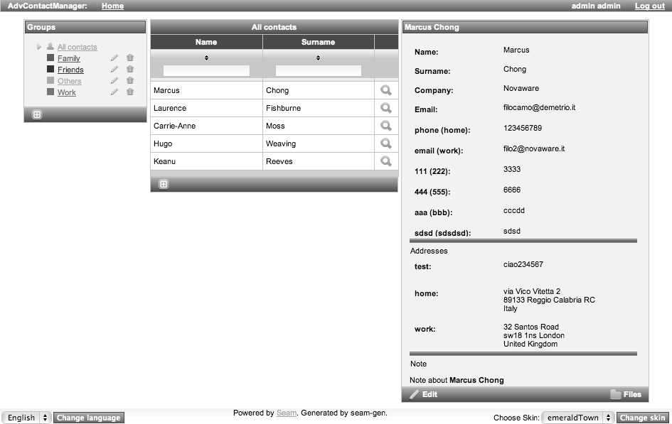
This is an example with the emeralTown skin set:
 If we change the skin to japanCherry, we have the following screenshot:
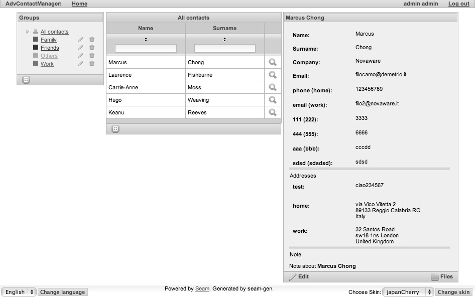 That’s without changing a single line of CSS or XHTML!
Edit a basic skin
Now let’s start creating our own basic skin. In order to do that, we are going to reuse one of the built-in skin files and change it. You can find the skin files in the richfaces-impl-3.x.x.jar file inside the META-INF/skins directory.
Let’s open the file and then open, for example, the emeraldTown.skin.properties file that looks like this (yes, the skin file is a .properties file!):
	#Colors
	headerBackgroundColor=#005000
	headerGradientColor=#70BA70
	headerTextColor=#FFFFFF
	headerWeightFont=bold

	generalBackgroundColor=#f1f1f1
	generalTextColor=#000000
	generalSizeFont=18px
	generalFamilyFont=Arial, Verdana, sans-serif

	controlTextColor=#000000
	controlBackgroundColor=#ffffff
	additionalBackgroundColor=#E2F6E2

	shadowBackgroundColor=#000000
	shadowOpacity=1

	panelBorderColor=#C0C0C0
	subBorderColor=#ffffff

	tabBackgroundColor=#ADCDAD
	tabDisabledTextColor=#67AA67

	trimColor=#BBECBB

	tipBackgroundColor=#FAE6B0
	tipBorderColor=#E5973E

	selectControlColor=#FF9409

	generalLinkColor=#43BD43
	hoverLinkColor=#FF9409
	visitedLinkColor=#43BD43

	# Fonts
	headerSizeFont=18px
	headerFamilyFont=Arial, Verdana, sans-serif

	tabSizeFont=11
	tabFamilyFont=Arial, Verdana, sans-serif

	buttonSizeFont=18
	buttonFamilyFont=Arial, Verdana, sans-serif

	tableBackgroundColor=#FFFFFF
	tableFooterBackgroundColor=#cccccc
	tableSubfooterBackgroundColor=#f1f1f1
	tableBorderColor=#C0C0C0
	tableBorderWidth=2px

	#Calendar colors
	calendarWeekBackgroundColor=#f5f5f5

	calendarHolidaysBackgroundColor=#FFEBDA
	calendarHolidaysTextColor=#FF7800

	calendarCurrentBackgroundColor=#FF7800
	c alendarCurrentTextColor=#FFEBDA

	calendarSpecBackgroundColor=#E2F6E2
	calendarSpecTextColor=#000000

	warningColor=#FFE6E6
	warningBackgroundColor=#FF0000

	editorBackgroundColor=#F1F1F1
	editBackgroundColor=#FEFFDA

	#Gradients
	gradientType=plain
In order to test it, let’s open our application project, create a file called mySkin.skin. properties inside the directory /resources/WEB-INF/, and add the above text. Then, let’s open the build.xml file and edit it, and add the following code into the war target:
	<copy
		tofile="${war.dir}/WEB-INF/classes/mySkin.skin.properties"
		file="${basedir}/resources/WEB-INF/mySkin.skin.properties"
	overwrite="true"/>
Also, as our application supports multiple skins, let’s open the components.xml file and add support to it:
	<property name="defaultSkin">mySkin</property>
	<property name="availableSkins">
		<b><value>mySkin</value></b>
		<value>laguna</value>
		<value>darkX</value>
		<value>glassX</value>
		<value>blueSky</value>
		<value>classic</value>
		<value>ruby</value>
		<value>wine</value>
		<value>deepMarine</value>
		<value>emeraldTown</value>
		<value>japanCherry</value>
	</property>
If you just want to select the new skin as the fixed skin, you would just edit the web.xml file and select the new skin by inserting the name into the context parameter (as explained before).
Just to make an (bad looking, but understandable) example, let’s change some parameters in the skin file:
	# Colors
	headerBackgroundColor=#005000
	headerGradientColor=#70BA70
	headerTextColor=#FFFFFF
	headerWeightFont=bold

	generalBackgroundColor=#f1f1f1
	generalTextColor=#000000
	<b>generalSizeFont=18px</b>
	generalFamilyFont=Arial, Verdana, sans-serif

	controlTextColor=#000000
	controlBackgroundColor=#ffffff
	additionalBackgroundColor=#E2F6E2

	shadowBackgroundColor=#000000
	shadowOpacity=1

	panelBorderColor=#C0C0C0
	subBorderColor=#ffffff

	tabBackgroundColor=#ADCDAD
	tabDisabledTextColor=#67AA67

	trimColor=#BBECBB

	tipBackgroundColor=#FAE6B0
	tipBorderColor=#E5973E

	selectControlColor=#FF9409
	generalLinkColor=#43BD43
	hoverLinkColor=#FF9409
	visitedLinkColor=#43BD43

	# Fonts
	<b>headerSizeFont=18px</b>
	headerFamilyFont=Arial, Verdana, sans-serif

	tabSizeFont=11
	tabFamilyFont=Arial, Verdana, sans-serif

	<b>buttonSizeFont=18</b>
	buttonFamilyFont=Arial, Verdana, sans-serif

	tableBackgroundColor=#FFFFFF
	tableFooterBackgroundColor=#cccccc
	tableSubfooterBackgroundColor=#f1f1f1
	tableBorderColor=#C0C0C0
	<b>tableBorderWidth=2px</b>

	#Calendar colors
	calendarWeekBackgroundColor=#f5f5f5

	calendarHolidaysBackgroundColor=#FFEBDA
	calendarHolidaysTextColor=#FF7800

	calendarCurrentBackgroundColor=#FF7800
	calendarCurrentTextColor=#FFEBDA

	calendarSpecBackgroundColor=#E2F6E2
	calendarSpecTextColor=#000000

	warningColor=#FFE6E6
	warningBackgroundColor=#FF0000

	editorBackgroundColor=#F1F1F1
	editBackgroundColor=#FEFFDA

	#Gradients
	gradientType=plain
Here is the screenshot of what happened with the new skin:
 How do I know which parameters to change? The official RichFaces Developer Guide contains, for every component, a table with the correspondences between the skin parameters and the CSS properties they are connected to.
Using CSS
What about when we need to change just a specific component’s look? And what if we need to change it just for a specific page?. In these cases, we can use the CSS framework to accomplish the tasks. For the first case, we can redefine the skin-inserted CSS classes, and for the second, we can specify our specific CSS classes for every component.
Redefine the skin-inserted CSS classes
Let’s come back to our example, we want to change the background for all of the panel headers. In the official RichFaces Developer Guide, we can see that we have to redefine the CSS class rich-panel-header. Let’s open the /view/stylesheet/theme.css and add the following code:
	.rich-panel-header {
		color: #FF0000;
		background: #9999ff repeat scroll 0 0;
	}
The result is as follows:
 By now, all of the rich:panel components have a new header redefined by the CSS class.
Specify our specific CSS classes
If we want to change the style for a specific component, we can just pass our custom CSS classes using the *Class attributes. In order to give an example, we are going to customize just the rich:toolBar component of the All contacts table—let’s open the /view/stylesheet/theme.css file and add our custom CSS class as follows:
	.my -custom-toolbar {
		background: #cccc00 repeat scroll 0 0;
	}
Now, let’s open the /view/main/contactsList.xhtml file and set the styleClass attribute with our newly created CSS class:
	...
	<rich:toolBar styleClass="my-custom-toolbar">
	...
The result of this customization is as shown in the following screenshot:
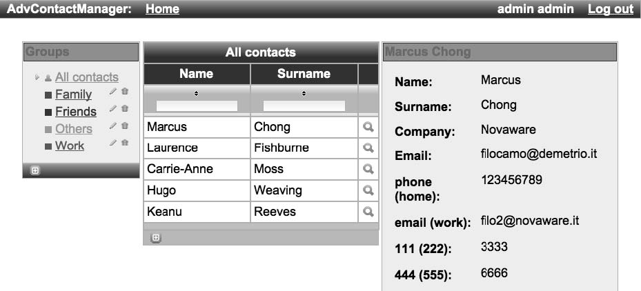 You can see that only the All contacts table toolbar is customized.
You can also insert inline CSS code using the style attribute of the component:
	...
	<rich:toolBar styleClass="my-custom-toolbar"
			<b>style="border: 2px solid #FF0000;"></b>
	...
You can see the following result:
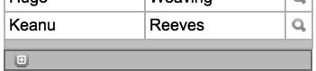 Even if we change the skin, our custom CSS settings will still be valid:
Using skins with non-skinnable components
The skinnability feature works only for RichFaces components, so, the same problems for which this feature was created would be found using other framework components (also using the standard JSF ones!). In order to be able to use the skin parameters also for non-RichFaces components, the framework declares an object called richSkin that permits access to the skin values.
Let’s see this code as an example:
#{richSkin.tabBackgroundColor}
Therefore, if we have a seam div component (s:div) and we still want to use the border color defined by the skin, we can use this code:
	<s:div
		style="border: 10px solid #{richSkin.panelBorderColor}">
		<h:outputText value="Example text" />
	</s:div>
And the color will be the one selected by our skin, so, for our new custom skin it will be as follows:
 Instead, for the japanCherry skin, it will be:
Standard controls skinning
For the s tandard XHTML controls, we have the options of customizing the style the RichFaces way.
RichFaces, in fact, unifies the application’s appearance by skinning the standard HTML elements the same way it does with the other components of the library.
There are two levels of skinning:
- Standard: For customizing only the basic properties (applies to IE 6, IE 7 in BackCompat mode and Safari)
- Extended: For customizing more properties with more styles (it applies to Mozilla Firefox and IE 7 in standards-compliant mode)
In order to activate the Standard controls skinning, it is sufficient to add a new context-param inside the web.xml file, like this:
	<context-param>
		<param-name>org.richfaces.CONTROL_SKINNING</param-name>
		<param-value>enable</param-value>
	</context-param>
This will enable the feature for our application.
Enabling the parameter in our application will skin the standard controls from this:
 So it appe ars like this:
 If you want to customize the standard controls using the CSS framework, you can also enable the org.richfaces.CONTROL_SKINNING_CLASSES context parameter (inside the web.xml file)—by doing so, you will be able to edit a set of CSS classes for skinning the XHTML components (some examples of CSS classes you can redefine are rich-select, rich-input-text, and so on that follow the rich-[-] pattern).
Extended s kinning in Opera and Safari
In order to resolve some problem with extended skinning in Opera and Safari, you can activate a JavaScript script that detects the browser and enables extended skinning only where supported. For doing that, just add the following code to the XHTML page (in our case, we would add it to the /view/layout/template.xhtml file):
	<script type="text/javascript">
		window.RICH_FACES_EXTENDED_SKINNING_ON = true;
	</script>
XCSS
Another way to use skin properties values for CSS classes is the XCSS. It is an XML version of the CSS used to extend the CSS feature and add extra functionalities. It is widely used inside the RichFaces framework, because of its fl exibility. In short, it is an XML version of the CSS file that contains skin parameters and dynamic resource generator classes. It is automatically converted in a standard CSS file suitable for all browsers.
In our application, you can open the /view/stylesheet/theme.xcss file and look at the definition created by Seam-gen for the project. As you can see, you have to use the and XML tags to create a CSS selector. Let’s see the following code for example:
This will read the values from the current skin and produce the following CSS code (if mySkin is selected):
.rich-panel-header {
		background-color: #005000;
		color: #FFFFFF;
	}
As you can see, the name attribute of the u:selector tag defines the CSS selector name, and the name attribute of the u:style tag defines the name of the CSS property. You can also use comma-separated CSS selector names into the u:selector name attribute to specify more selector at a time:
<u:selector name=".rich-panel-header, .rich-panel-body">
	...
Another feature is the possibility to use Java resources inside the CSS to dynamically generate images; in theme.xcss, you can find some examples to generate gradients:
<u:selector name=".rich-table-subheadercell">
		<u:style name="background-image">
			<f:resource f:key="org.richfaces.renderkit.images.TabGradientB"/>
		</u:style>
	</u:selector>
XCSS is very powerful and extends the CSS framework for skinning every component we need to skin!
Summary
In this chapter, we’ve seen all the powerful customization capabilities that the RichFaces framework offers. In the next chapter, we will create a new skin using the plug ‘n’ skin technology.
