
ColorPicker is an input component with a color palete, where it’s value should be a hex string. ColorPicker has two modes, default mode is popup and other available option is inline. Inline mode displays the picker directly into the view.
1. ColorPicker Tag Info
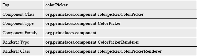
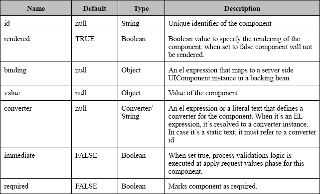
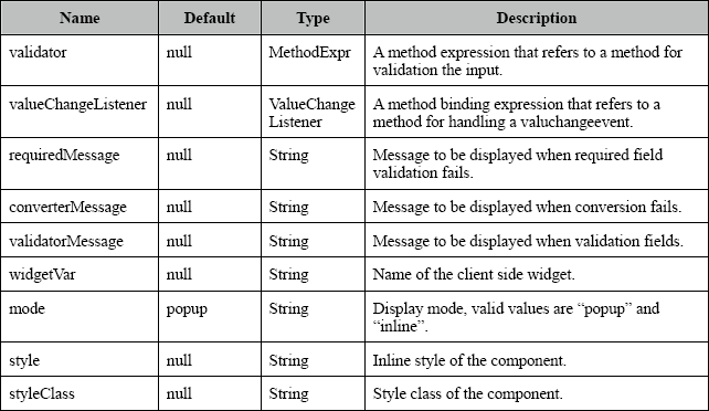
2. ColorPicker Tag Attributes
3. The View
index.xhtml
<html xmlns="http://www.w3.org/1999/xhtml"
	xmlns:ui="http://java.sun.com/jsf/facelets"
	xmlns:h="http://java.sun.com/jsf/html"
	xmlns:f="http://java.sun.com/jsf/core"
	xmlns:p="http://primefaces.org/ui">
	<h:head>
		<script name="jquery/jquery.js" library="primefaces"></script>
	</h:head>
	<f:view>
		<h:form prependId="false">
			<h1>JavaBeat Primefaces Example</h1>
			<h2>Primefaces - ColorPicker </h2>
			<p:colorPicker value="#{colorPicker.color}" mode="inline"></p:colorPicker>
			#{' '}
			<h:commandButton value="Display" action="#{colorPicker.action}"></h:commandButton>
			#{' '}
			<h:outputText value="#{colorPicker.color}"></h:outputText>
		</h:form>
	</f:view>
</html>
4. Managed Bean
ColorPicker.java
package net.javabeat.primefaces;

import javax.faces.bean.ManagedBean;
import javax.faces.bean.SessionScoped;
@ManagedBean
@SessionScoped
public class ColorPicker {

	private String color;

	public String getColor() {
		return color;
	}

	public void setColor(String color) {
		this.color = color;
	}

	public String action(){
		return "";
	}
}
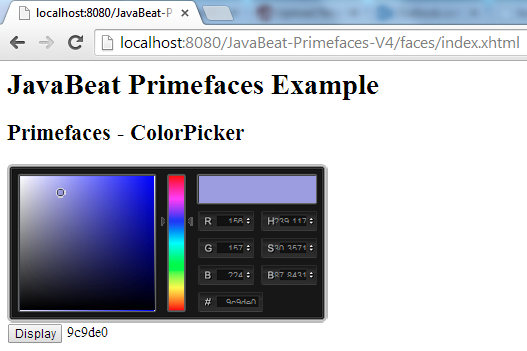
5. Primefaces ColorPicker Demo
The below snapshot shows you the using of colorPicker component.
&nbps;
 JQuery Callbacks Object