1. Introduction to PrimeFaces Input Elements
This tutorial covers some of the basic primefaces UI components like p:calendar (the PrimeFaces input element for collecting dates and times), p:spinner and p:slider (PrimeFaces input element for collecting numbers). This tutorial also talks about the style of programming with PrimeFaces in JSF2, and also briefly summarizes the PrimeFaces versions of some of the standard JSF elements:
- p:commandButton
- p:message
- p:messages
- p:fieldset
- p:ajax
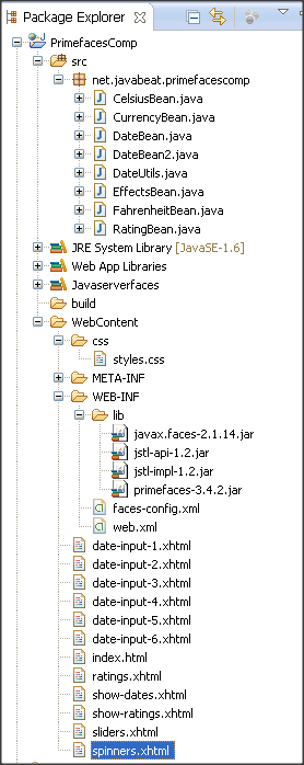
In our last tutorials, we worked with Maven but this time I created all the examples as a JSF2 Dynamic Web Project in Eclipse.
2. p:calendar Overview
Key points need to be noted on Calendar component
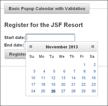
- Appearance and behavior is like textfield with associated popup calendar.
- Purpose is to collectdates from user by usine Value attribute which is automatically converted to java.util.Date. UI prevents user from entering an illegal value.
- Ajax behavior:In PrimeFaces defines “dateSelect” event on Calendar component. By this this component can respond by using p:ajax.
Summary of Most Important Attributes
normal syntax :
<p:calendar value="...".../>
- Value should point to bean property of type Date.
- Mode (popup [default] or inline), indicates whether calendar pop up will be shown on click or always be shown?
- showButtonPanel (true or false [default]) indicates to show “Today” and “Done” buttons at bottom of the calendar?
- showOn (focus [default], button, both) decides to display the calendar with button or without.
- navigator (true or false [default]) shows menu that lets users navigate to month or year.
- pages (integer[default is 1]) indicates number of months to show at once.
- Effect (slide, explode, fold, fadeIn, etc. [default: none]) is Animation effect for showing and hiding calendar.
p:calendar can collect time as well as dates
- Use “pattern” to tell p:calendar what info to collect
- Use timeOnly=”true” if you want to only select a time
- The bean property is still of type java.util.Date, since the Date class already stores times
p:calendar Examples
Collect a date and a time in 24-hour format
<p:calendar value="…" pattern="MM/dd/yyyy HH:mm"/>
Collect a date and time in 12-hour format with am/pm
<p:calendar value="…" pattern="MM/dd/yyyy hh:mm a"/>
Collect only a time (no user choice of day)
<p:calendar value="…" pattern="HH:mm" timeOnly="true"/>
Note: Day will default to Jan 1, 1970, but there will be no calendar for choosing or changing the day when only time is shown.
3. p:calendar Implementation
In this example we will see basic calendar usage with small custom validation.
Create a managed bean
In this bean, there are two properties with start date and end date and there is register method for navigation with custom validation .Startday and endday properties used for formatting dates for display.
package net.javabeat.primefacescomp;

import java.util.Date;

import javax.faces.application.FacesMessage;
import javax.faces.bean.ManagedBean;
import javax.faces.context.FacesContext;

@ManagedBean
public class DateBean {
  private Date startDate, endDate;

  public Date getStartDate() {
    return(startDate);
  }

  public void setStartDate(Date startDate) {
    this.startDate = startDate;
  }

  public Date getEndDate() {
    return(endDate);
  }

  public void setEndDate(Date endDate) {
    this.endDate = endDate;
  }

  /** Returns a String representing the starting date, in a form similar to
   * "Tuesday, November 13, 2013". For use in results page.
   */
  public String getStartDay() {
    return(DateUtils.formatDay(startDate));
  }

  /** Returns a String representing the ending date, in a form similar to
   * "Wednesday, November 2, 2013". For use in results page.
   */
  public String getEndDay() {
    return(DateUtils.formatDay(endDate));
  }

  public String register() {
    FacesContext context = FacesContext.getCurrentInstance();
    if (!startDate.before(endDate)) {
      endDate = null;
      FacesMessage errorMessage =
        new FacesMessage("End date must be after start date");
      errorMessage.setSeverity(FacesMessage.SEVERITY_ERROR);
      context.addMessage(null, errorMessage);
      return(null);
    } else {
      return("show-dates");
    }
  }
}
Helper Class
This one more java class mainly used for formatting date.
package net.javabeat.primefacescomp;

import java.util.Date;

public class DateUtils {

  /** Given a Date, returns a String of the form "Day, Month Number, Year",
   *  e.g., "Wednesday, November 14, 2013". Used by getStartDay and getEndDay.
   */
  public static String formatDay(Date date) {
    if (date == null) {
      return("");
    } else {
      return(String.format("%tA, %tB %te, %tY",
                           date, date, date, date));
    }
  }

  /** Given a Date, returns a String of the form "hh:mm:ss am on Day, Month Number, Year",
   *  e.g., "12:23:42 pm on Wednesday, November 14, 2013". Used by getSampleTime.
   */
  public static String formatTime(Date date) {
    if (date == null) {
      return("");
    } else {
      return(String.format("%tl:%tM:%tS %tp on %tA, %tB %te, %tY",
                            date, date, date, date, date, date, date, date));
    }
  }

  private DateUtils() {} // Uninstantiatable class
}
Input form : date-input-1.xhtml
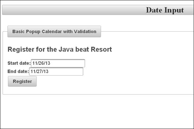
- This Input page collects Start and end dates.
- Calendar pops up when user clicks in textfield.
- Validation is done on date required, end date after start date.
- Example uses required and requiredMessage for validation. Also custom validation is performed in managed bean, with message set unless the end date is later than the start date.
<!DOCTYPE html PUBLIC "-//W3C//DTD XHTML 1.0 Transitional//EN"
  "http://www.w3.org/TR/xhtml1/DTD/xhtml1-transitional.dtd">
<html xmlns="http://www.w3.org/1999/xhtml"
      xmlns:h="http://java.sun.com/jsf/html"
      xmlns:f="http://java.sun.com/jsf/core"
      xmlns:p="http://primefaces.org/ui">
<h:head><title>Date Input</title>
</h:head>
<h:body>
<h1 class="ui-widget-header ui-corner-all" align="center">Date Input</h1>
<br/>
<p:fieldset legend="Basic Popup Calendar with Validation">
<h:form>
   <h2>Register for the JSF Resort</h2>
   <p:messages/>
   <!--  Note that validatorMessage not needed because the UI
         will not let you enter an illegal date. -->
   <strong>Start date:</strong>
   <p:calendar value="#{dateBean.startDate}"
               required="true"
               requiredMessage="Start date required"/><br/>
   <strong>End date:</strong>
   <p:calendar value="#{dateBean.endDate}"
               required="true"
               requiredMessage="End date required"/><br/>
   <p:commandButton action="#{dateBean.register}" ajax="false" value="Register"/><p/>
</h:form>
</p:fieldset>
</h:body></html>
Result page: show-dates.xhtml
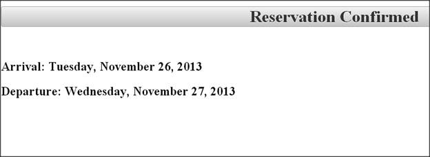
It simply confirms the entered input dates are correct.
<!DOCTYPE html PUBLIC "-//W3C//DTD XHTML 1.0 Transitional//EN"
  "http://www.w3.org/TR/xhtml1/DTD/xhtml1-transitional.dtd">
<html xmlns="http://www.w3.org/1999/xhtml"
      xmlns:h="http://java.sun.com/jsf/html">
<h:head><title>Reservation Confirmed</title>
</h:head>
<h:body>
<h1 class="ui-widget-header ui-corner-all" align="center">Reservation Confirmed</h1>
<br/>
<h2>Arrival: #{dateBean.startDay}</h2>
<h2>Departure: #{dateBean.endDay}</h2>
</h:body></html>
Inline calendars: date-input-2.xhtml
This is one more example that shows Calendat in inline and no textfield is shown.
Syntax :
<p:calendar value="..." mode="inline" .../>
• Default is popup, so omitting mode is same as mode=”popup”
• Bean and results page – Same as in previous example, so code not repeated here.
<!DOCTYPE html PUBLIC "-//W3C//DTD XHTML 1.0 Transitional//EN"
  "http://www.w3.org/TR/xhtml1/DTD/xhtml1-transitional.dtd">
<html xmlns="http://www.w3.org/1999/xhtml"
      xmlns:h="http://java.sun.com/jsf/html"
      xmlns:p="http://primefaces.org/ui">
<h:head><title>Date Input</title>
</h:head>
<h:body>
<h1 class="ui-widget-header ui-corner-all" align="center">Date Input</h1>
<br/>
<p:fieldset legend="Inline Calendar">
<h:form>
   <h2>Register for the JSF Resort</h2>
   <p:messages/>
   <strong>Start date:</strong>
   <p:calendar value="#{dateBean.startDate}"
               mode="inline"
               required="true"
               requiredMessage="Start date required"/><br/>
   <strong>End date:</strong>
   <p:calendar value="#{dateBean.endDate}"
               mode="inline"
               required="true"
               requiredMessage="End date required"/><br/>
   <p:commandButton action="#{dateBean.register}"
                    value="Register" ajax="false"/><br/>
</h:form>
</p:fieldset>
</h:body></html>
4. PrimeFaces Versions of Standard Elements
Every standard JSF(h:component) input element has a corresponding primefaces (p: component) element. For example, h:inputText and h:commandButton can be replaced by p:inputText and p:commandButton.
Advantages
Theme-aware ==> The elements automatically pick up the fonts, colors, and sizes of the current theme. If we change the theme, the p: component elements change automatically.
Extra features ==> many of the p: component elements add extra functionality in addition to being theme-aware.
Summary of simple Elements used in this section
- Additional features: “icon” attribute, Ajax functionality. For icon, refer to a CSS name with a background-image property.
- p:messages- Additional feature: automatic Ajax updates. By setting autoUpdate=”true”, messages update for every Ajax request.
- p:fieldset- Additional feature: toggling. By setting toggleable=”true”, the end user can interactively hide/collapse and redisplay the content.
- p:inputText and p:inputTextArea– can also use p:watermark to set placeholder text
- p:password–It is replace of h:inputSecret (notice the inconsistent name).
- Also supports feedback regarding password strength.
- p:selectOneMenu, p:selectManyMenu, p:selectOneRadio, etc.– replace For h:selectOneMenu, h:selectManyMenu, h:selectOneRadio, etc. Can also display custom content and animation effects.
5. p:ajax overview
This feature mainly designed for PrimeFaces elements.
Note: Use p:ajax instead of f:ajax when used in the body of PrimeFaces elements.
Following are the key points about p:ajax.
- Uses “update” instead of “render” and “process” instead of “execute”.
- More events– Many of the PrimeFaces elements define new events to respond to. For example, p:calendar defines a “dateSelect” event. However, p:ajax does not usually define reasonable defaults like f:ajax does. For example, with p:calendar,we must explicitly say
-
<p:ajax event="dateSelect".../>
-
- Simpler listeners– When we use , the method can take zero arguments, unlike with f:ajax.
- Documentation note– p:ajax is listed under AjaxBehavior.
6. p:ajax Implementation
In this implementation we initially see input form xhtml and managed bean.
Input Page: date-input-3.xhtml
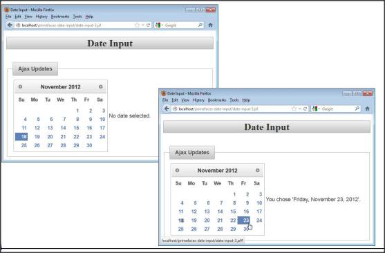
This page shows popup calendar and message showing current selection. Message updates whenever user clicks on a date throw ajax.
<!DOCTYPE html PUBLIC "-//W3C//DTD XHTML 1.0 Transitional//EN"
  "http://www.w3.org/TR/xhtml1/DTD/xhtml1-transitional.dtd">
<html xmlns="http://www.w3.org/1999/xhtml"
      xmlns:h="http://java.sun.com/jsf/html"
      xmlns:p="http://primefaces.org/ui">
<h:head><title>Date Input</title>
</h:head>
<h:body>
<h1 class="ui-widget-header ui-corner-all" align="center">Date Input</h1>
<br/>
<p:fieldset legend="Ajax Updates">
<h:form>
<h:panelGrid columns="2">
   <p:calendar value="#{dateBean2.sampleDate}" mode="inline">
      <p:ajax event="dateSelect" update="selection"/>
   </p:calendar>
   <h:outputText value="#{dateBean2.sampleDay}" id="selection"/>
</h:panelGrid>
</h:form>
</p:fieldset>
</h:body></html>
Mangaed Bean: DateBean2.java
This Bean has getter/setter for Date and getter for formatted Date and importantly no special methods to support Ajax where result date shown on main page.
package net.javabeat.primefacescomp;

import java.util.Date;

import javax.faces.bean.ManagedBean;

@ManagedBean
public class DateBean2 {
  private Date sampleDate;

  public Date getSampleDate() {
    return (sampleDate);
  }

  public void setSampleDate(Date sampleDate) {
    this.sampleDate = sampleDate;
  }

  public String getSampleDay() {
    if (sampleDate == null) {
      return("No date selected.");
    } else {
      String message =
        String.format("You choose '%s'.",
                      DateUtils.formatDay(sampleDate));
      return(message);
    }
  }

  public String getSampleTime() {
    if (sampleDate == null) {
      return("No date/time selected.");
    } else {
      String message =
        String.format("You choose '%s'.",
                      DateUtils.formatTime(sampleDate));
      return(message);
    }
  }
}
7. Animation Effects
After getting some quick idea on Ajax usage in primefaces, let’s see one more interesting topic, I.e. Animation effects. Primefaces mainly uses JQueryUI animation effects. So following are the effects can be done in primefaces,
- blind: Gradually shows more/less of image. See “clip”.
- bounce: Shows the image, then bounces it up and down.
- clip: Gradually shows more/less of image. For the difference between “blind” and “clip”, think of a window with a face showing in it. With “blind”, the face stays in the same position but the blind being raised/lowered shows more/less of the face. With “clip”, the blind is totally open, but the face moves up or down. Don’t be confused J we will see in an example.
- drop: Drops image in from left. Looks identical to “slide”.
- explode: Image gets bigger and breaks into pieces
- fade (or fadeIn): Increases opacity until visible
- fold: Appearance like unfolding a piece of paper
- highlight: Image briefly highlighted in yellow
- puff: To disappear, image gets bigger and bigger.
- pulsate: Image flashes on/off
- scale: To disappear, gets smaller and smaller
- shake: Like “pulsate”, but left/right instead of up/down
- size: Supposedly like “scale”, but effect hard to see
- slide: Slides in from the left. To me, looks identical to “drop”
- slideDown: Slides down from top instead of left
More documentation on effects and details on each effect are available at http://docs.jquery.com/UI/Effects
Basic syntax
<p:component … effect="slide"/>
8. Implementation of Animation in Calendar Component
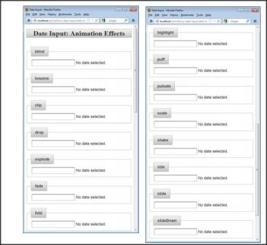
Primefaces components that support effects are p:dialog, p:imageSwitch, p:orderList, p:overlayPanel, p:pickList, p:selectOneMenu, p:tooltip.The best way to get a feel for what each effect does is to run them interactively.
Managed Bean: EffectsBean
In this bean, we create a property of availableEffects and assign in form to show.
package net.javabeat.primefacescomp;

import javax.faces.bean.*;

@ApplicationScoped
@ManagedBean
public class EffectsBean {
  private String[] availableEffects =
    { "blind", "bounce", "clip", "drop", "explode",
      "fade", "fold", "highlight", "puff", "pulsate",
      "scale", "shake", "size", "slide", "slideDown" };

  public String[] getAvailableEffects() {
    return(availableEffects);
  }
}
Example Page: date-input-5.xhtml
In this page we shown all the animation effects on calendar component.
<!DOCTYPE html PUBLIC "-//W3C//DTD XHTML 1.0 Transitional//EN"
  "http://www.w3.org/TR/xhtml1/DTD/xhtml1-transitional.dtd">
<html xmlns="http://www.w3.org/1999/xhtml"
      xmlns:h="http://java.sun.com/jsf/html"
      xmlns:ui="http://java.sun.com/jsf/facelets"
      xmlns:p="http://primefaces.org/ui">
<h:head><title>Date Input</title>
</h:head>
<h:body>
<h1 class="ui-widget-header ui-corner-all" align="center">
Date Input: Animation Effects</h1>
<br/>
<ui:repeat var="effect" value="#{effectsBean.availableEffects}">
<p:fieldset legend="#{effect}">
<h:form>
<h:panelGrid columns="2">
   <p:calendar value="#{dateBean2.sampleDate}" effect="#{effect}">
      <p:ajax event="dateSelect" update="selection"/>
   </p:calendar>
   <h:outputText value="#{dateBean2.sampleDay}" id="selection"/>
</h:panelGrid>
</h:form>
</p:fieldset>
<br/>
</ui:repeat>
</h:body></html>
9. p:spinner Overview
- Appearance and behavior: Text field with arrow-like buttons for incrementing or decrementing values. User can also type number directly in the textfield.
- Purpose: for collecting numbers from user– Value is automatically converted to number. UI prevents user from entering an illegal value. Component can collect either whole number or floating point number.
Summary of Most Important Attributes
syntax: <p:spinner value="..." .../>
- Value: Usually refers to bean property of type double or Double. Can also be int (or Integer) if you also set the stepFactor to be a whole number (or use default of 1).
- min, max: Smallest/largest values allowed. Be sure initial value of bean property is in that range (usually min).
- stepFactor: How much the value changes when user clicks on up or down buttons. Default is 1.
- Prefix: Value to display at front of number (like a currency symbol). Does not become part of the value.
10. p:spinner Implementation
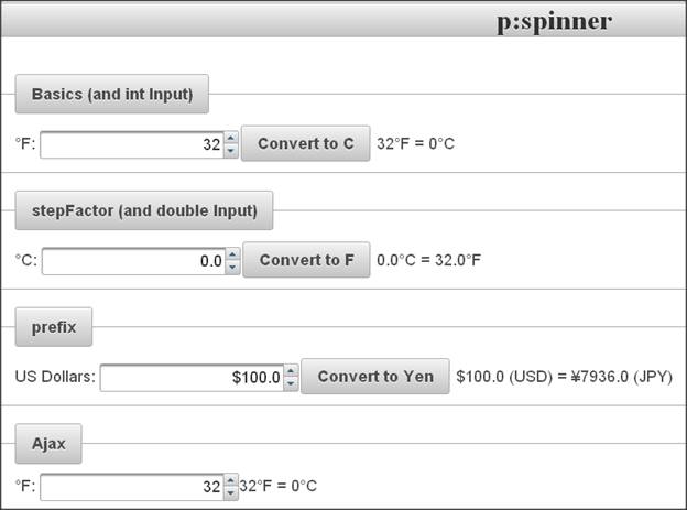
This example gathering numeric input with spinners (textfields with up/down arrows) and also can gather int or double.
Example Page spinners.xhtml
<!DOCTYPE html PUBLIC "-//W3C//DTD XHTML 1.0 Transitional//EN"
"http://www.w3.org/TR/xhtml1/DTD/xhtml1-transitional.dtd">
<html xmlns="http://www.w3.org/1999/xhtml"
xmlns:h="http://java.sun.com/jsf/html"
xmlns:f="http://java.sun.com/jsf/core"
xmlns:p="http://primefaces.org/ui">
<h:head><title>p:spinner</title>
</h:head>
<h:body>
<h1 class="ui-widget-header ui-corner-all" align="center">p:spinner</h1>
<br/>
<p:fieldset legend="Basics (and int Input)">
<h:form>
°F:
<p:spinner min="32" max="212" value="#{fBean.f}"/>
<p:commandButton value="Convert to C" ajax="false"/>
#{fBean.f}°F = #{fBean.c}°C
</h:form>
</p:fieldset>
<br/>
<p:fieldset legend="stepFactor (and double Input)">
<h:form>
°C:
<p:spinner min="0" max="100" stepFactor="0.5" value="#{cBean.c}"/>
<p:commandButton value="Convert to F" ajax="false"/>
#{cBean.c}°C = #{cBean.f}°F
</h:form>
</p:fieldset>
<br/>
<p:fieldset legend="prefix">
<h:form>
US Dollars:
<p:spinner prefix="$" value="#{currencyBean.dollars}"/>
<p:commandButton value="Convert to Yen" ajax="false"/>
$#{currencyBean.dollars} (USD) = ¥#{currencyBean.yen} (JPY)
</h:form>
</p:fieldset>
<br/>
<p:fieldset legend="Ajax">
<h:form>
°F:
<p:spinner min="32" max="212" value="#{fBean.f}">
<p:ajax update="f c"/>
</p:spinner>
<h:outputText value="#{fBean.f}°F" id="f"/>
=
<h:outputText value="#{fBean.c}°C" id="c"/>
</h:form>
</p:fieldset>
</h:body></html>
Managed Bean: FahrenheitBean
package net.javabeat.primefacescomp;

import javax.faces.bean.ManagedBean;

// Note that the names for this bean (fBean1, fBean2, fBean3) are
// are defined in faces-config.xml. The repeated names are so that I can use
// more than one instance in the same page.

@ManagedBean(name="fBean")
public class FahrenheitBean {
  private int f=32;

  public int getF() {
    return (f);
  }

  public void setF(int f) {
    this.f = Math.max(f, -460);  // -459.67 is absolute zero
  }

  public int getC() {
    return((int)((f - 32)*(5.0/9.0)));
  }

  public String getStatus() {
    return(String.format("%s°F = %s°C",
                         f, getC()));
  }
}
Managed Bean: CelsiusBean
package net.javabeat.primefacescomp;

import javax.faces.bean.ManagedBean;

@ManagedBean(name="cBean")
public class CelsiusBean {
  private double c;

  public double getC() {
    return(c);
  }

  public void setC(double c) {
    this.c = Math.max(c, -273.15); // -273.15 is absolute zero
  }

  public double getF() {
    return(c*9.0/5.0 + 32);
  }
}
11. p:slider overview
- Appearance and behavior: Draggable slider with number displayed in associated textfield. User can also type number directly in the textfield.
- Purpose: for collecting numbers from user– Value is automatically converted to number. UI prevents user from entering an illegal value and it can collect whole numbers only.
Slider takes up width of containing element
- This is usually too big, unless containing element is a table cell or a div with a width given in CSS
- You can also use p:panelGrid, but borders are usually visible.
So, put slider in a table cell via h:panelGrid
<h:panelGrid>
<h:panelGroup>…<p:inputText id="blah" value="…"/></h:panelGroup>
<p:slider minValue="…" maxValue="…" for="blah"/>
<h:panelGroup>…</h:panelGroup>
</h:panelGrid>
</pre>
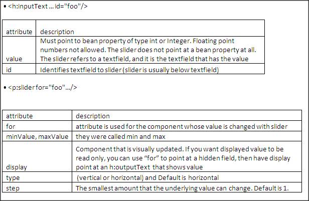
Syntax and attributes
12. p:slider Impementation
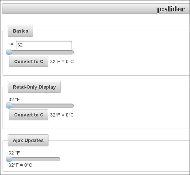
This example shows mainly temperature conversion.
Temperature in Fahrenheit– UI will collect whole number in range from 32 to 212.
User can either drag slider or type value into textfield and here.(Note: Used same managed bean as above)
Example page sliders.xhtml
<!DOCTYPE html PUBLIC "-//W3C//DTD XHTML 1.0 Transitional//EN"
"http://www.w3.org/TR/xhtml1/DTD/xhtml1-transitional.dtd">
<html xmlns="http://www.w3.org/1999/xhtml"
xmlns:h="http://java.sun.com/jsf/html"
xmlns:f="http://java.sun.com/jsf/core"
xmlns:p="http://primefaces.org/ui">
<h:head><title>p:slider</title>
</h:head>
<h:body>
<h1 class="ui-widget-header ui-corner-all" align="center">p:slider</h1>
<br/>
<p:fieldset legend="Basics">
<h:form>
<h:panelGrid>
<h:panelGroup>
°F:
<p:inputText id="fInput1" value="#{fBean.f}"/>
</h:panelGroup>
<p:slider minValue="32" maxValue="212" for="fInput1"/>
<h:panelGroup>
<p:commandButton value="Convert to C" ajax="false"/>
#{fBean.f}°F = #{fBean.c}°C<p/>
</h:panelGroup>
</h:panelGrid>
</h:form>
</p:fieldset>
<br/>
<p:fieldset legend="Read-Only Display">
<h:form>
<h:panelGrid>
<h:panelGroup>
<h:inputHidden id="fInput2" value="#{fBean.f}" />
<h:outputText id="fDisplay2" value="#{fBean.f}"/>
°F
</h:panelGroup>
<p:slider minValue="32" maxValue="212" for="fInput2"
display="fDisplay2"/>
<h:panelGroup>
<p:commandButton value="Convert to C" ajax="false" />
#{fBean.f}°F = #{fBean.c}°C<p/>
</h:panelGroup>
</h:panelGrid>
</h:form>
</p:fieldset>
<br/>
<p:fieldset legend="Ajax Updates">
<h:form>
<h:panelGrid width="200">
<h:panelGroup>
<h:inputHidden id="fInput3" value="#{fBean.f}" />
<h:outputText id="fDisplay3" value="#{fBean.f}"/>
°F
</h:panelGroup>
<p:slider minValue="32" maxValue="212" for="fInput3"
display="fDisplay3">
<p:ajax process="fInput3" update="status"/>
</p:slider>
<h:outputText value="#{fBean.status}" id="status" escape="false"/>
</h:panelGrid>
</h:form>
</p:fieldset>
</h:body></html>
[download id=”23″]

 How To Write Custom Tag in JSP?