
In general, the progress bar is a graphical user interface used to visualize progression of computer operation such as file download, file transfer, showing action status to the users or installation of files. For instance, consider a task running within program that might take a while to complete. It provides some indication to user that the task is running, how long it may take to complete, how much work has already been done etc. These are all the activities which can be shown by using the progress bars.
Bootstrap provides progress bars which uses CSS transition and animations to give some effects for various activities as specified in the above paragraph. This tutorial explains following topics which are used with bootstrap progress bars.
- Default Progress Bar
- Progress Bar with Label
- Alternative Progress Bars
- Striped Progress Bar
- Animated Progress Bar
- Stacked Progress Bar
also read:
To create progress bar, just wrap the .progress class within the div element and next, inside another div element add .progress-bar class.
The below examples shows the various techniques used for implementing the progress bars in Bootstrap. If you have any questions about bootstrap progress bars, please write it in the comments section.
Bootstrap Default Progress Bar
The following example demonstrates creation of default progress bar:
<!DOCTYPE html>
<head>
<title>Bootstrap Example</title>
    <link rel="stylesheet" href="http://netdna.bootstrapcdn.com/bootstrap/3.1.1/css/bootstrap.min.css">
    <script src="https://ajax.googleapis.com/ajax/libs/jquery/1.11.0/jquery.min.js"></script>
    <script src="http://netdna.bootstrapcdn.com/bootstrap/3.1.1/js/bootstrap.min.js"></script>
</head>
<body>
<div class="container">
<h2>Default Progress Bar</h2>
<div class="progress">
   <div class="progress-bar" role="progressbar" aria-valuenow="50"
      aria-valuemin="0" aria-valuemax="100" style="width: 55%;">
   <span class="sr-only">55% Complete</span>
   </div>
</div>
</div>
</body>
</html>

Bootstrap Progress Bar with Label
We can create progress bar to show visible percentage by just removing the .sr-only class within progress bar. It will show the percentage level on the progress bar as shown in the below example:
<!DOCTYPE html>
<head>
<title>Bootstrap Example</title>
    <link rel="stylesheet" href="http://netdna.bootstrapcdn.com/bootstrap/3.1.1/css/bootstrap.min.css">
    <script src="https://ajax.googleapis.com/ajax/libs/jquery/1.11.0/jquery.min.js"></script>
    <script src="http://netdna.bootstrapcdn.com/bootstrap/3.1.1/js/bootstrap.min.js"></script>
</head>
<body>
<div class="container">
<h2>Progress Bar with Label</h2>
<div class="progress">
   <div class="progress-bar" role="progressbar" aria-valuenow="50"
      aria-valuemin="0" aria-valuemax="100" style="width: 55%;">55% Complete</span>
   </div>
</div>
</div>
</body>
</html>

Bootstrap Alternative Progress Bars
It’s possible to create different types of progress bars each with different colors by simply wrapping those classes with div element. Following are the four types which provide different styles to progress bar:
- progress-bar-success
- progress-bar-info
- progress-bar-warning
- progress-bar-danger
Use these classes within div element along with base class .progress-bar class. The following is an example:
<!DOCTYPE html>
<head>
<title>Bootstrap Example</title>
    <link rel="stylesheet" href="http://netdna.bootstrapcdn.com/bootstrap/3.1.1/css/bootstrap.min.css">
<script src="https://ajax.googleapis.com/ajax/libs/jquery/1.11.0/jquery.min.js"></script>
    <script src="http://netdna.bootstrapcdn.com/bootstrap/3.1.1/js/bootstrap.min.js"></script>
</head>
<body>
<div class="container">
<h2>Contextual Alternatives of Progress Bar</h2><br>
<div class="progress">
   <div class="progress-bar progress-bar-success" role="progressbar" aria-valuenow="90"
      aria-valuemin="0" aria-valuemax="100" style="width: 75%;">
  	  80% Complete (Success Bar)
   </div>
</div><br>
<div class="progress">
   <div class="progress-bar progress-bar-info" role="progressbar" aria-valuenow="90"
      aria-valuemin="0" aria-valuemax="100" style="width: 65%;">
  	  65% Complete (Info Bar)
   </div>
</div><br>
<div class="progress">
   <div class="progress-bar progress-bar-waring" role="progressbar" aria-valuenow="90"
      aria-valuemin="0" aria-valuemax="100" style="width: 55%;">
  	  50% Complete (Warning Bar)
   </div>
</div><br>
<div class="progress">
   <div class="progress-bar progress-bar-danger" role="progressbar" aria-valuenow="90"
      aria-valuemin="0" aria-valuemax="100" style="width: 35%;">
  	  30% Complete (Danger Bar)
   </div>
</div>
</div>
</body>
</html>

Bootstrap Striped Progress Bar
We can create striped effect to progress bars by using the .progress-striped class within div element along with .progress class. The following is an example:
<!DOCTYPE html>
<head>
<title>Bootstrap Example</title>
    <link rel="stylesheet" href="http://netdna.bootstrapcdn.com/bootstrap/3.1.1/css/bootstrap.min.css">
    <script src="https://ajax.googleapis.com/ajax/libs/jquery/1.11.0/jquery.min.js"></script>
    <script src="http://netdna.bootstrapcdn.com/bootstrap/3.1.1/js/bootstrap.min.js"></script>
</head>
<body>
<div class="container">
<h2>Striped Progress Bars</h2><br>
<div class="progress progress-striped">
   <div class="progress-bar progress-bar-success" role="progressbar" aria-valuenow="90"
      aria-valuemin="0" aria-valuemax="100" style="width: 70%;">
  	  70% Complete (Success Bar)
   </div>
</div>
<div class="progress progress-striped">
   <div class="progress-bar progress-bar-info" role="progressbar" aria-valuenow="90"
      aria-valuemin="0" aria-valuemax="100" style="width: 55%;">
  	  55% Complete (Info Bar)
   </div>
</div><br>
<div class="progress progress-striped">
   <div class="progress-bar progress-bar-warning" role="progressbar" aria-valuenow="90"
      aria-valuemin="0" aria-valuemax="100" style="width: 45%;">
  	  45% Complete (Warning Bar)
   </div>
</div><br>
<div class="progress progress-striped">
   <div class="progress-bar progress-bar-danger" role="progressbar" aria-valuenow="90"
      aria-valuemin="0" aria-valuemax="100" style="width: 30%;">
  	  30% Complete (Danger Bar)
   </div>
</div>
</div>
</body>
</html>

Bootstrap Animated Progress Bar
We can animate the stripes from right to left by adding the .active class .progress-bar-striped class within div element. The following is an example:
<!DOCTYPE html>
<head>
<title>Bootstrap Example</title>
    <link rel="stylesheet" href="http://netdna.bootstrapcdn.com/bootstrap/3.1.1/css/bootstrap.min.css">
    <script src="https://ajax.googleapis.com/ajax/libs/jquery/1.11.0/jquery.min.js"></script>
    <script src="http://netdna.bootstrapcdn.com/bootstrap/3.1.1/js/bootstrap.min.js"></script>
</head>
<body>
<div class="container">
<h2>Striped Progress Bars</h2><br>
<div class="progress progress-striped active">
   <div class="progress-bar progress-bar-success" role="progressbar" aria-valuenow="90"
      aria-valuemin="0" aria-valuemax="100" style="width: 70%;">
  	  70% Complete (Success Bar)
   </div>
</div>
<div class="progress progress-striped active">
   <div class="progress-bar progress-bar-info" role="progressbar" aria-valuenow="90"
      aria-valuemin="0" aria-valuemax="100" style="width: 55%;">
  	  55% Complete (Info Bar)
   </div>
</div><br>
<div class="progress progress-striped active">
   <div class="progress-bar progress-bar-warning" role="progressbar" aria-valuenow="90"
      aria-valuemin="0" aria-valuemax="100" style="width: 45%;">
  	  45% Complete (Warning Bar)
   </div>
</div><br>
<div class="progress progress-striped active">
   <div class="progress-bar progress-bar-danger" role="progressbar" aria-valuenow="90"
      aria-valuemin="0" aria-valuemax="100" style="width: 30%;">
  	  30% Complete (Danger Bar)
   </div>
</div>
</div>
</body>
</html>

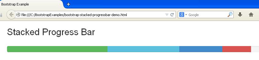
Bootstrap Stacked Progress Bar
We can add multiple progress bars into the same progress bar to stack them by adding all the contextual classes within the .progress class as shown in the following example:
<!DOCTYPE html>
<head>
<title>Bootstrap Example</title>
    <link rel="stylesheet" href="http://netdna.bootstrapcdn.com/bootstrap/3.1.1/css/bootstrap.min.css">
    <script src="https://ajax.googleapis.com/ajax/libs/jquery/1.11.0/jquery.min.js"></script>
    <script src="http://netdna.bootstrapcdn.com/bootstrap/3.1.1/js/bootstrap.min.js"></script>
</head>
<body>
<div class="container">
<h2>Stacked Progress Bar</h2><br>
<div class="progress">
   <div class="progress-bar progress-bar-success" role="progressbar" aria-valuenow="90"
      aria-valuemin="0" aria-valuemax="100" style="width: 35%;">
  	  <span class="sr-only">35% Complete (Success Bar)</span>
   </div>
   <div class="progress-bar progress-bar-info" role="progressbar" aria-valuenow="90"
      aria-valuemin="0" aria-valuemax="100" style="width: 25%;">
  	  <span class="sr-only">25% Complete (Info Bar)</span>
   </div>
   <div class="progress-bar progress-bar-waring" role="progressbar" aria-valuenow="90"
      aria-valuemin="0" aria-valuemax="100" style="width: 15%;">
  	  <span class="sr-only">15% Complete (Warning Bar)</span>
   </div>
   <div class="progress-bar progress-bar-danger" role="progressbar" aria-valuenow="90"
      aria-valuemin="0" aria-valuemax="100" style="width: 10%;">
  	  <span class="sr-only">10% Complete (Danger Bar)</span>
   </div>
</div>
</div>
</body>
</html>
 Java HashSet Example